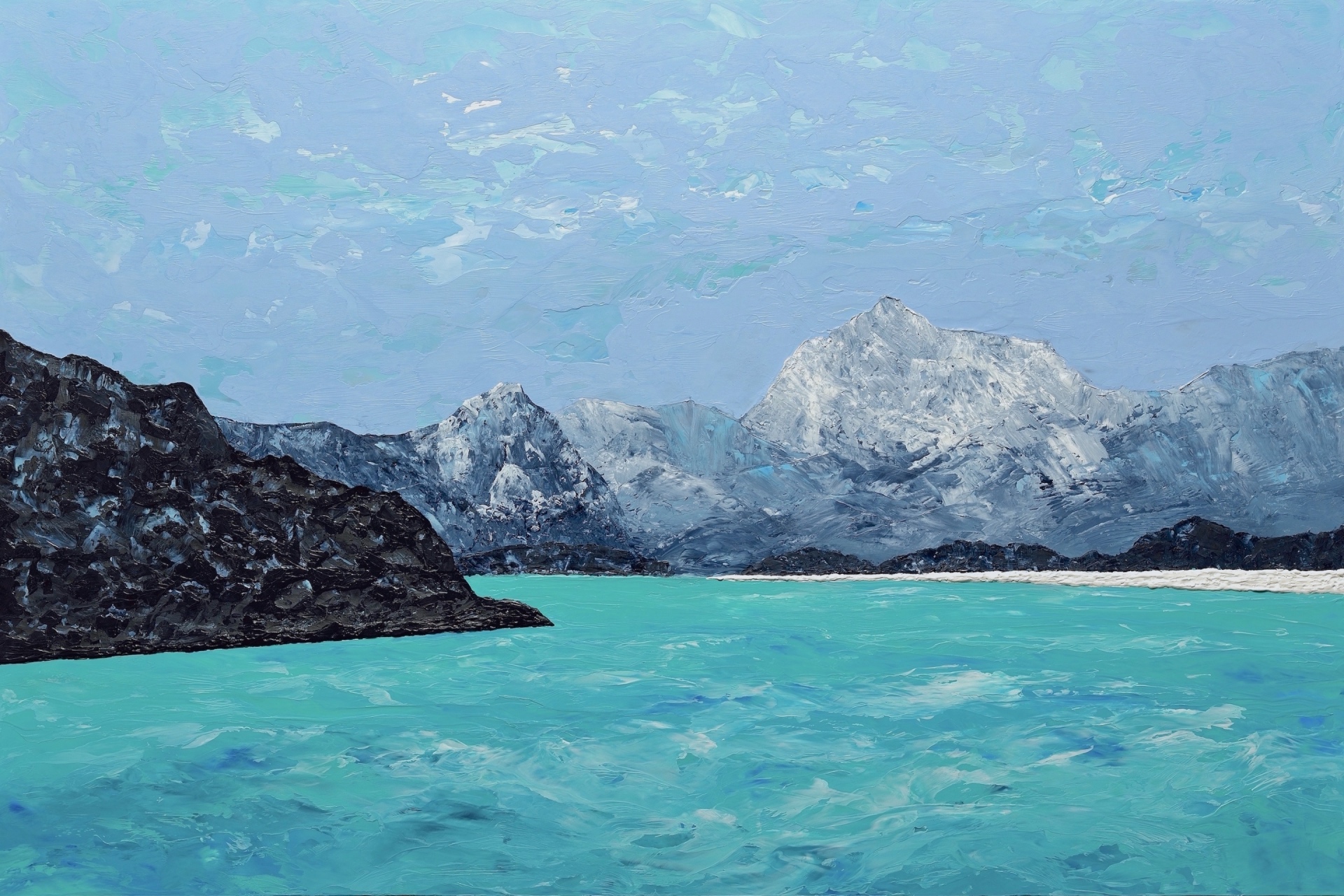
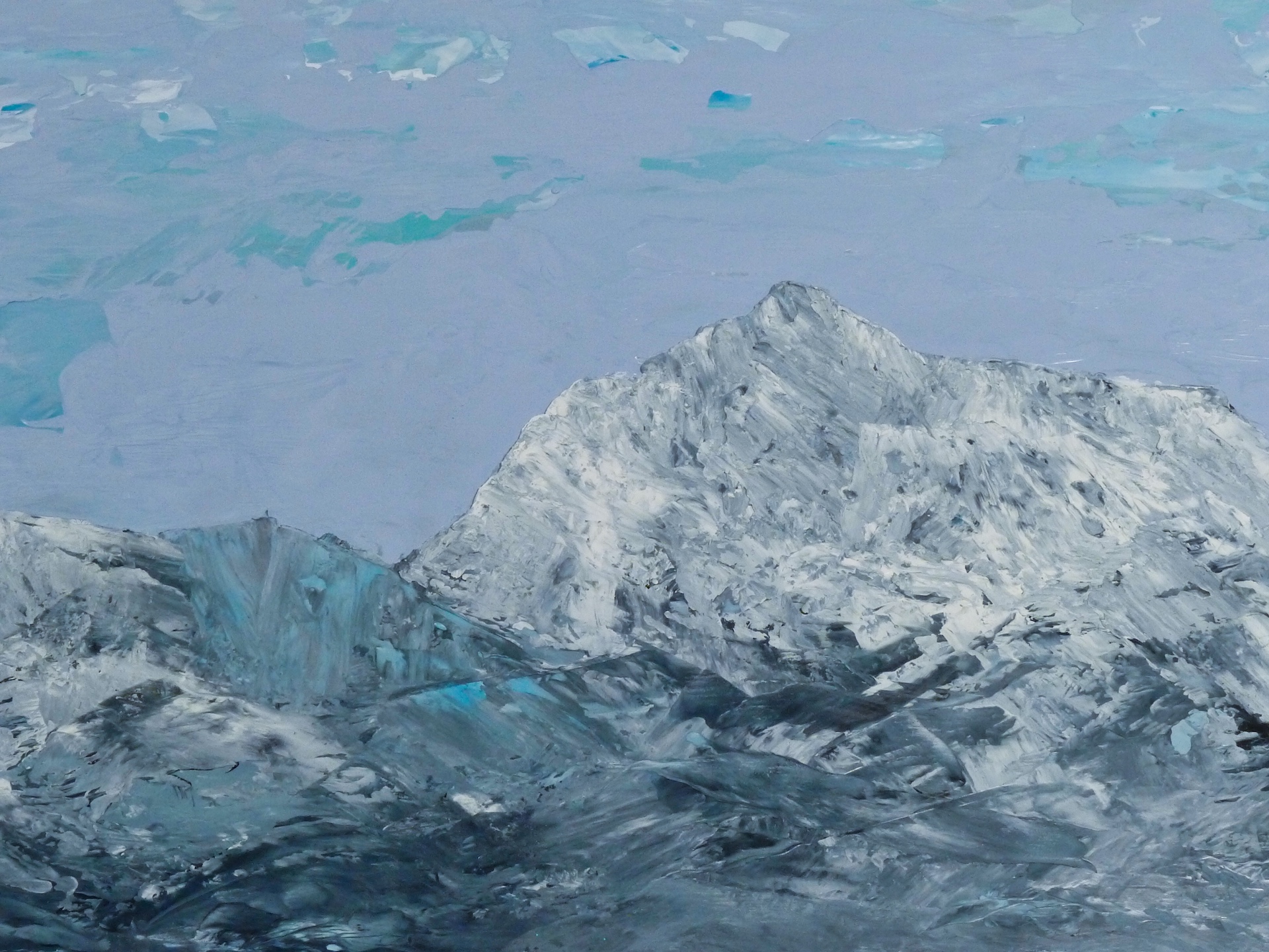
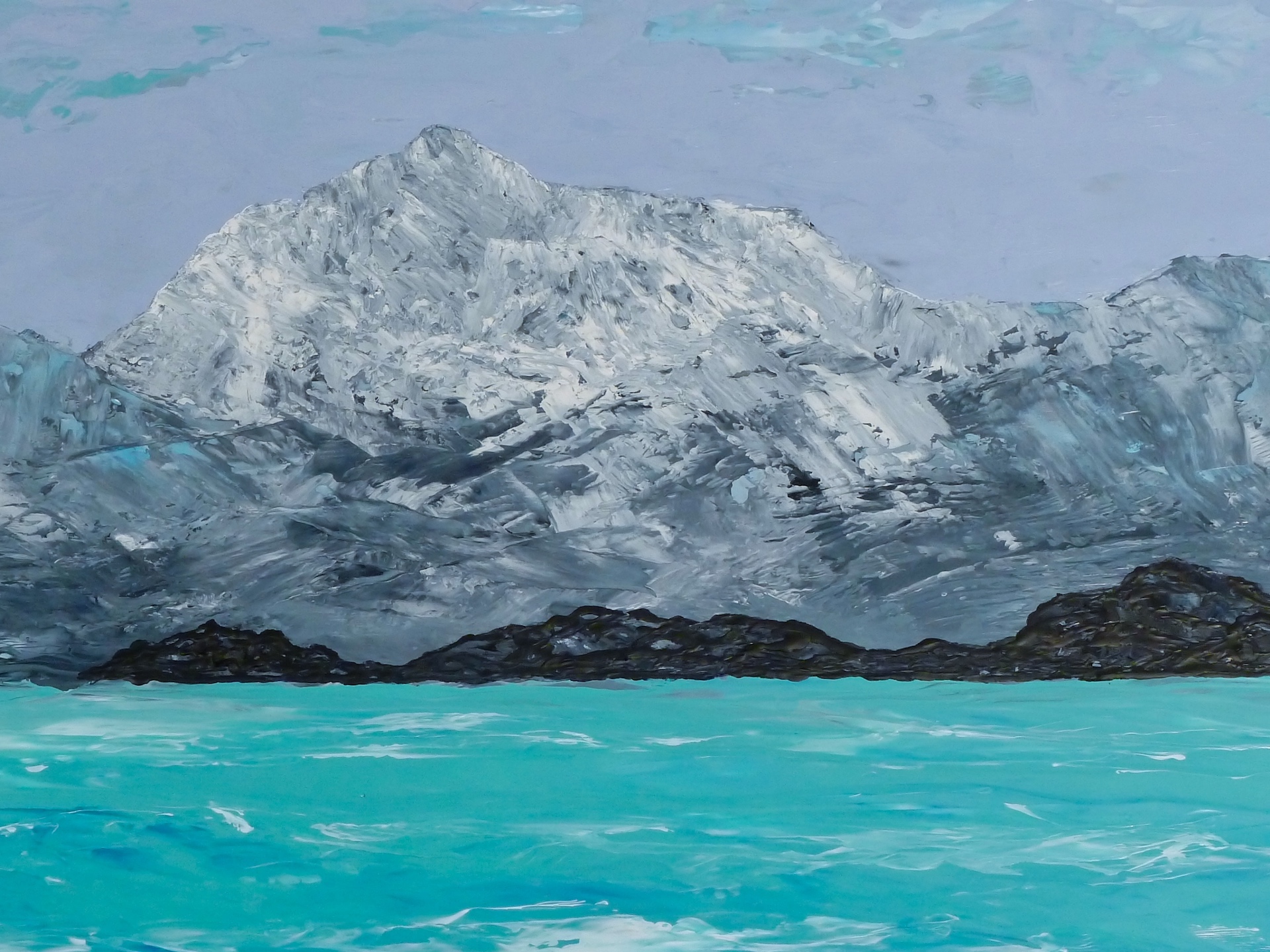
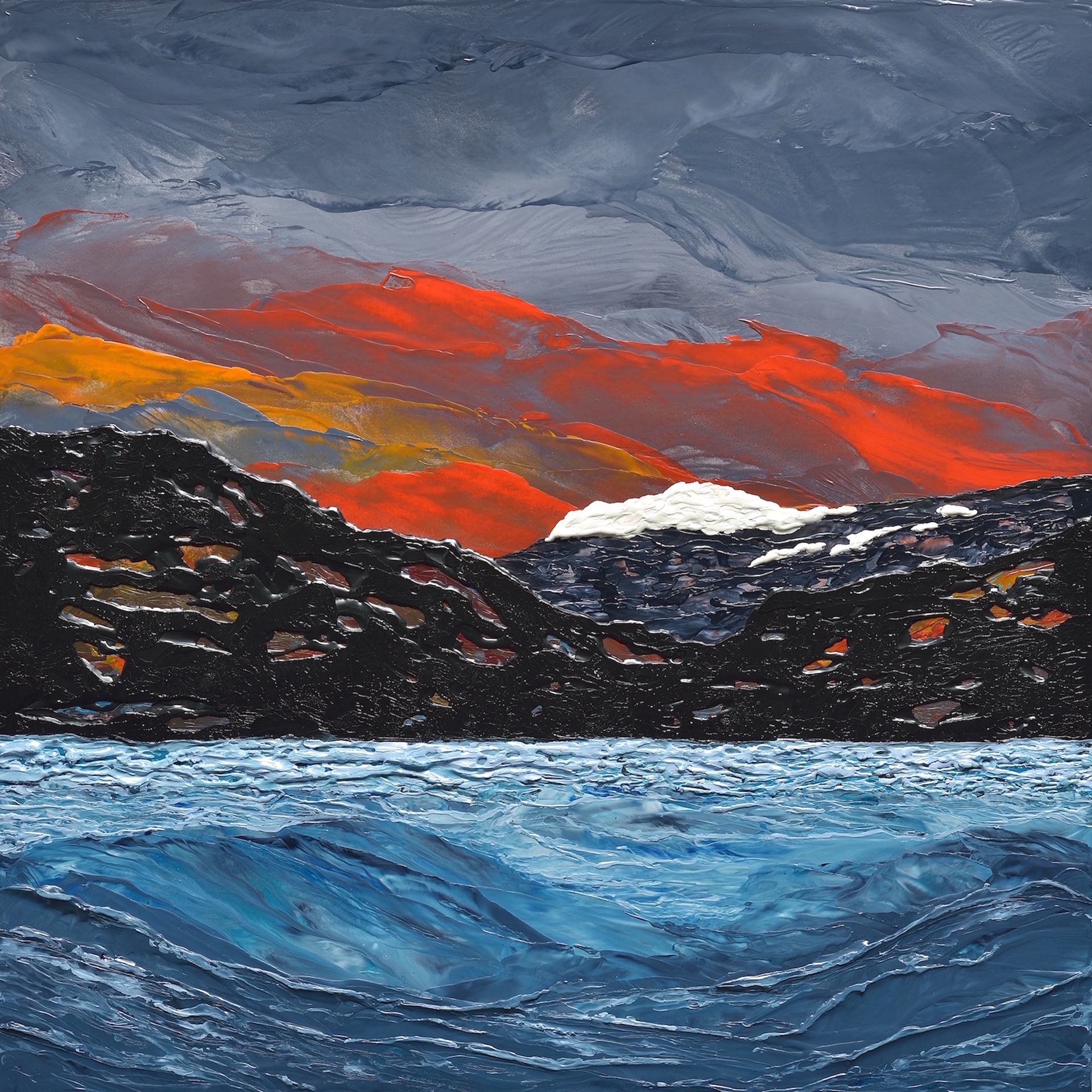
Polar Project IV was painted using oil and wax on a 24 x 36 inch cradled birch panel.
Alaska is beautiful. There is so much to take in: the vastness of the landscape, the sense of space, the grandness of mountains, the sense of light, the peacefulness, the cold, the variety of weather. This has inspired me to create a series of paintings in an attempt to capture all of this.
Concept
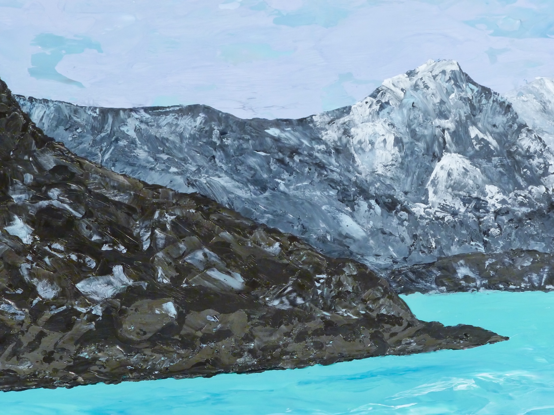
My motivation for this painting was to convey the sense of grandeur and ruggedness of an expansive Alaskan coastline and capture some of the beauty that can be found there…all had to somehow get onto the canvas.
Challenges
I needed to create a sense of depth in the painting. I also wanted to convey the vastness of the landscape on my relatively small 24×36 inch panel. In the case of my planned composition, these were conflicting priorities. To create an impression of grandness, I didn’t include any foreground elements to remove any reference for gauging the scale of the scene. Painters portray distant objects in muted cool tones and with minimal detail to mimic how distant landscapes are perceived in reality. I wanted this painting to be about the distant landscape so I didn’t want to do this. My dilemma…I would have created a painting with a distant shoreline of blurry and textureless mountains with nothing to look at except a few waves. Paintings aren’t interesting without a subject matter.
Artistic Intent
My plan and the choices I made were based on my intent for this painting. Another artist may have made different choices resulting in a different painting.
1. Creating a sense of grandness:
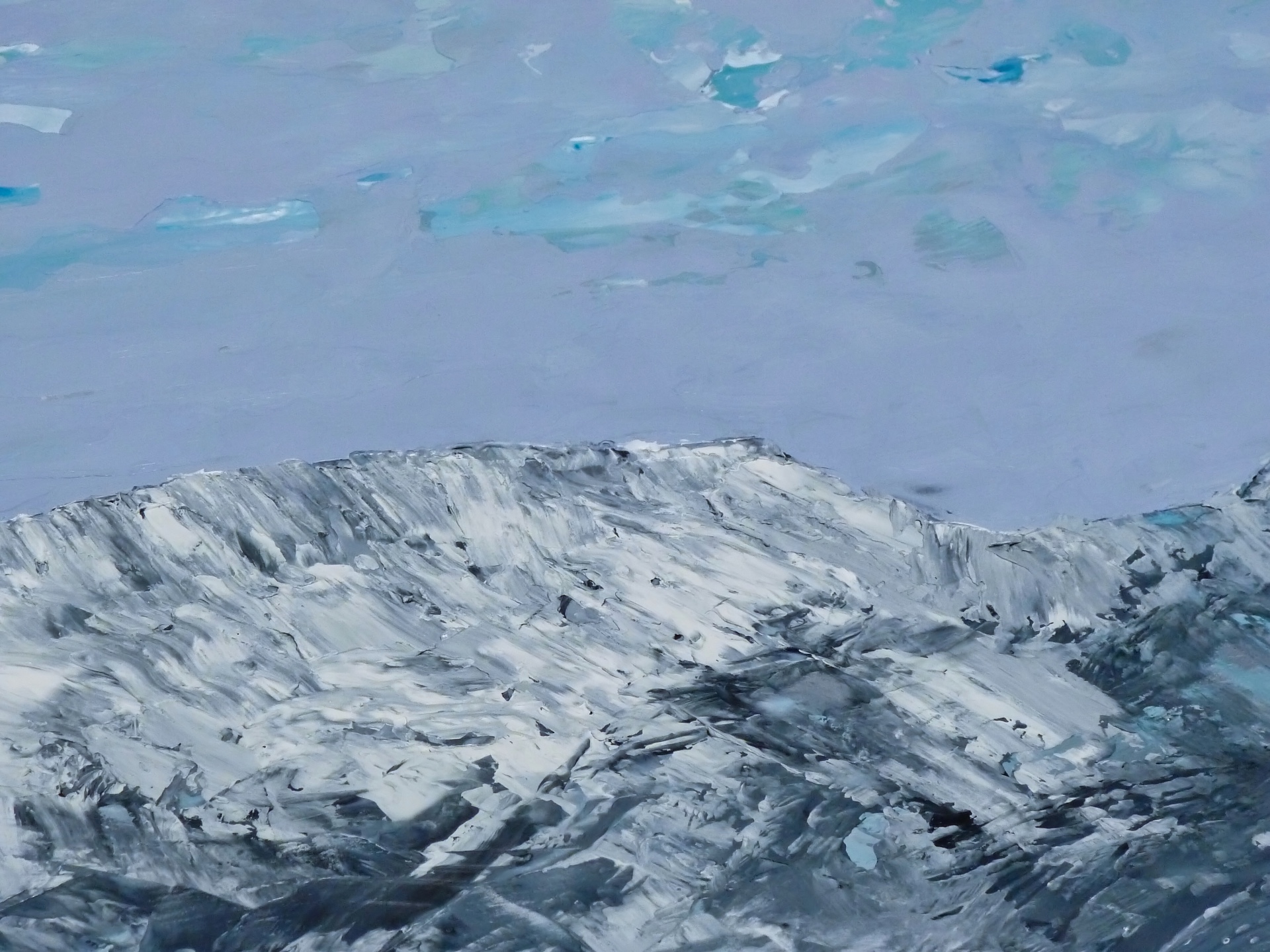
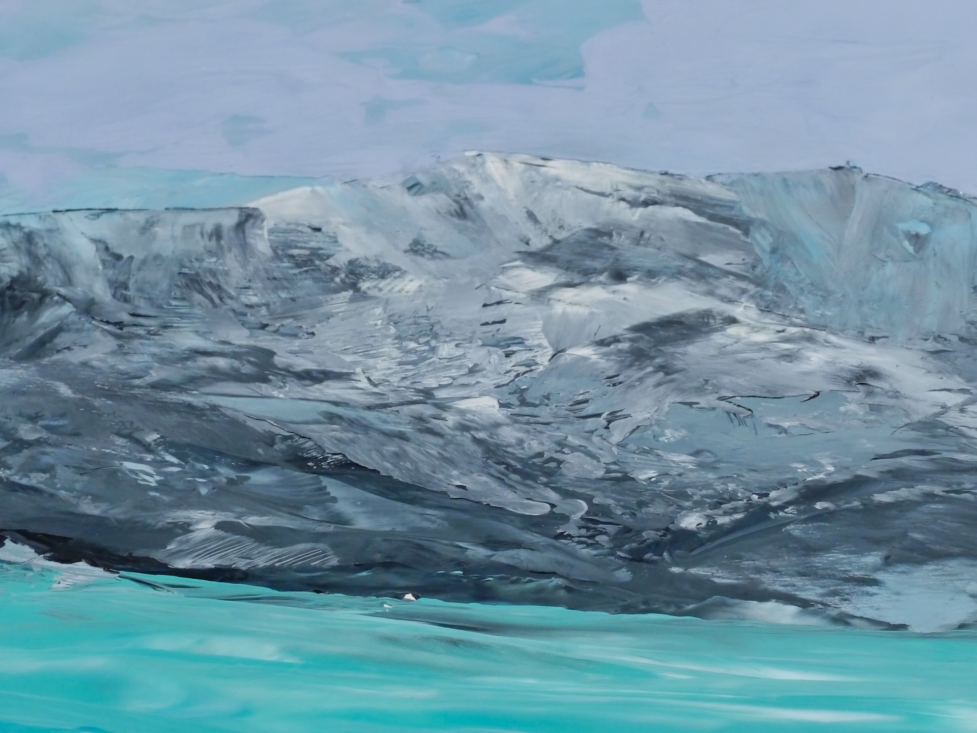
Given the challenges associated with this piece, I knew I would need to reconcile my conflicting design priorities to succeed. So I broke a rule; I put so much detail into the distant mountains that you need a magnifying glass (!) to see it all, thereby positioning the distant mountainous shoreline as the main subject matter. This detail, when viewed in close proximity, serves to create an impression of “vastness”. This is due to being able to view something perceived as being “compositionally” distant, as something that is defined/painted (accessible, defined forms, details, textures, colours…) as if in close proximity to the viewer.
2. Capturing the luminous glow and peaceful atmosphere:
The revealing and transformative qualities of light are, perhaps, the core elements of my approach to painting—this piece typifies this:
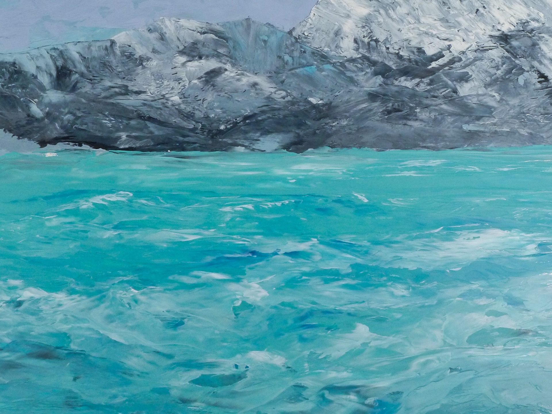
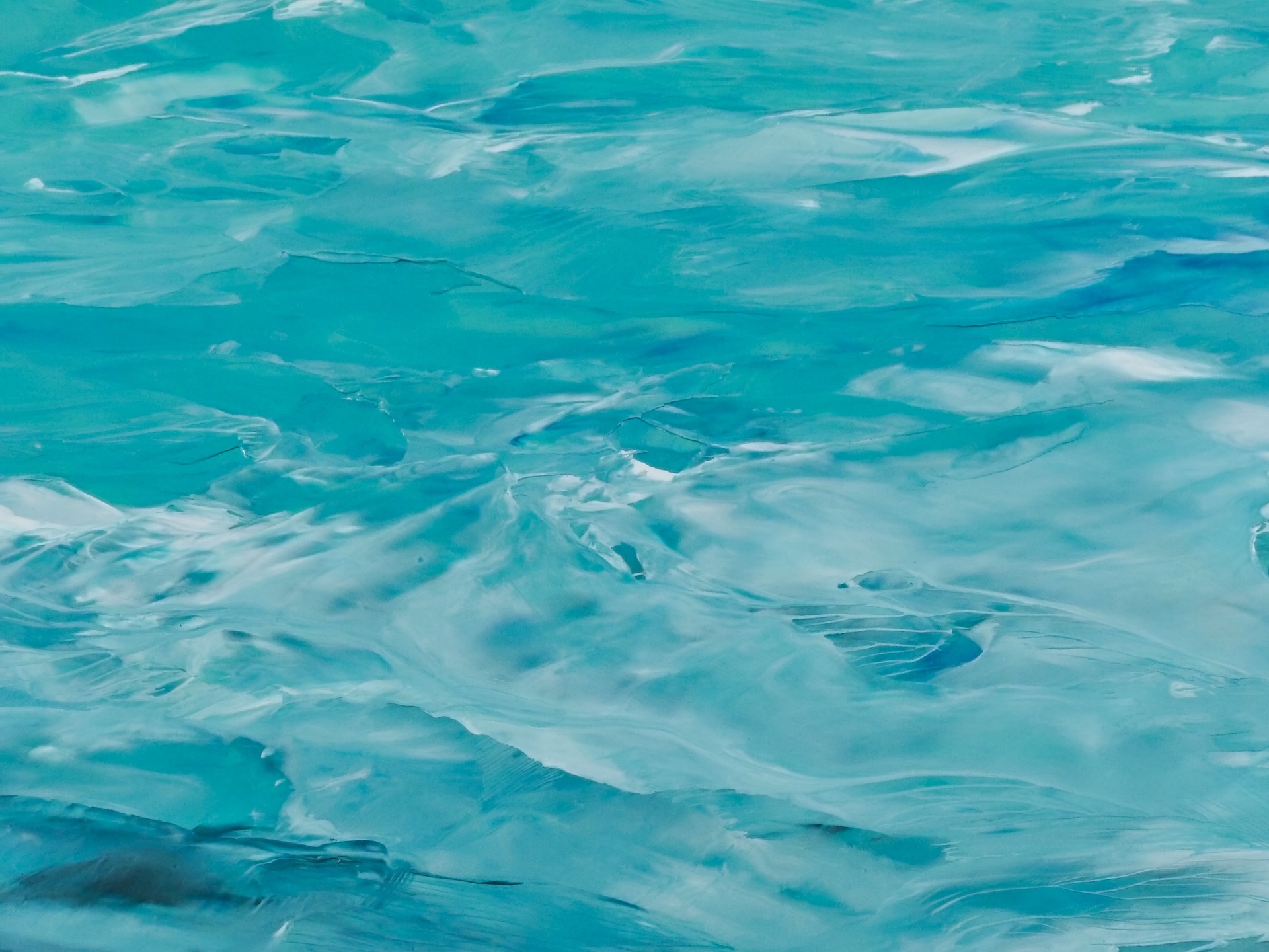
– I chose to portray the water as relatively calm and quite colourful under even illumination from a cloudy sky. Both the water and the sky share a similar palette, the water being primarily one colour and the sky having modulated colours and textures. Together, they serve to create a calming atmosphere and frame the mountainous shoreline that spans the entire painting from side to side.
– The minimal sense of movement in both the water and the sky also contributes to the peaceful setting of the scene and encourages a slow exploration of the entire painting.
Viewing Experience
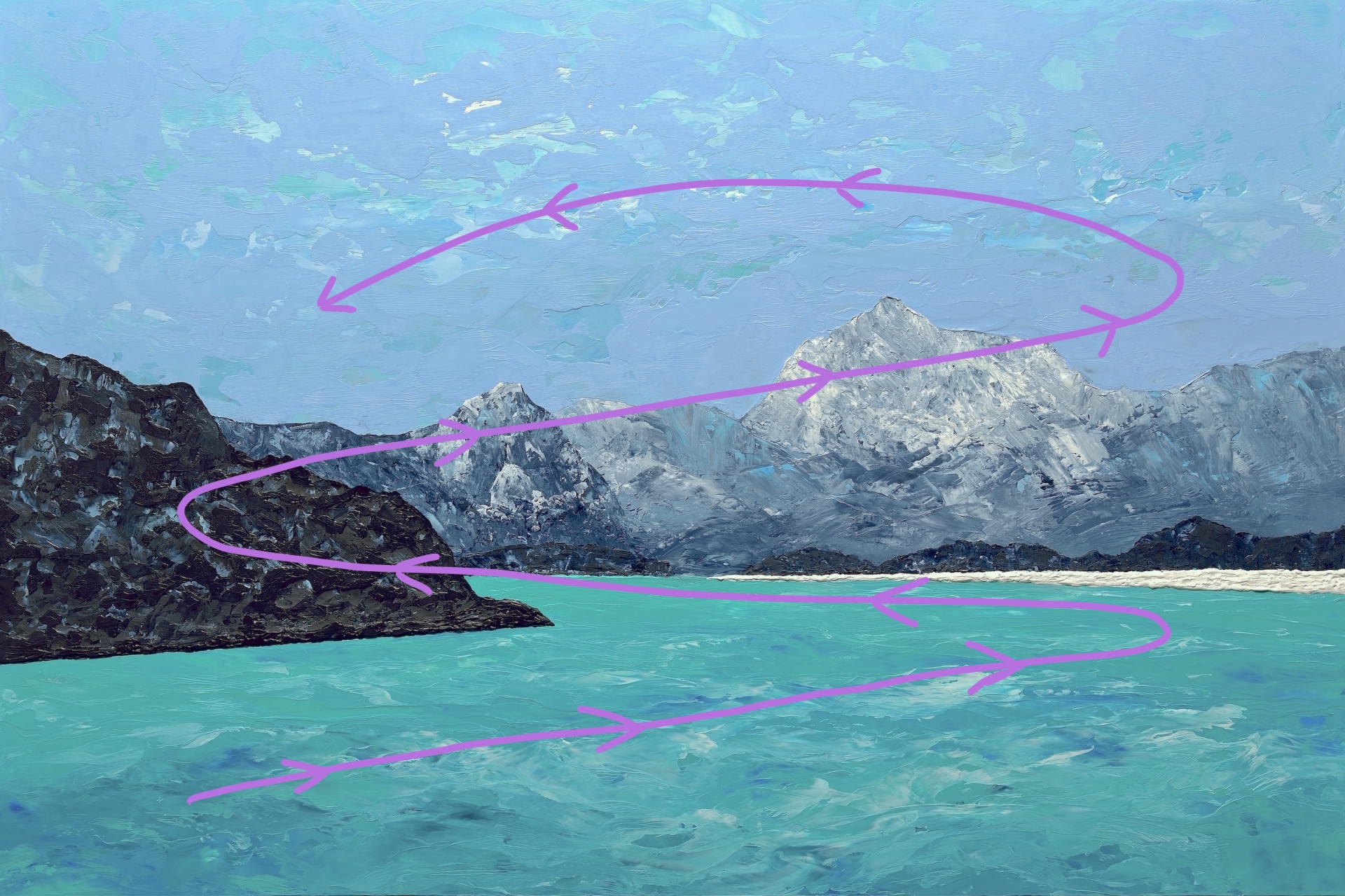
This painting leverages geometric graphic elements to draw the viewer into the painting’s centre where the distant mountains and the rest of the painting can be explored. Introducing these elements of abstraction makes the painting more interesting and enhances the viewing experience (essentially a zigzag pattern beginning in the lower left and ending in the sky area):
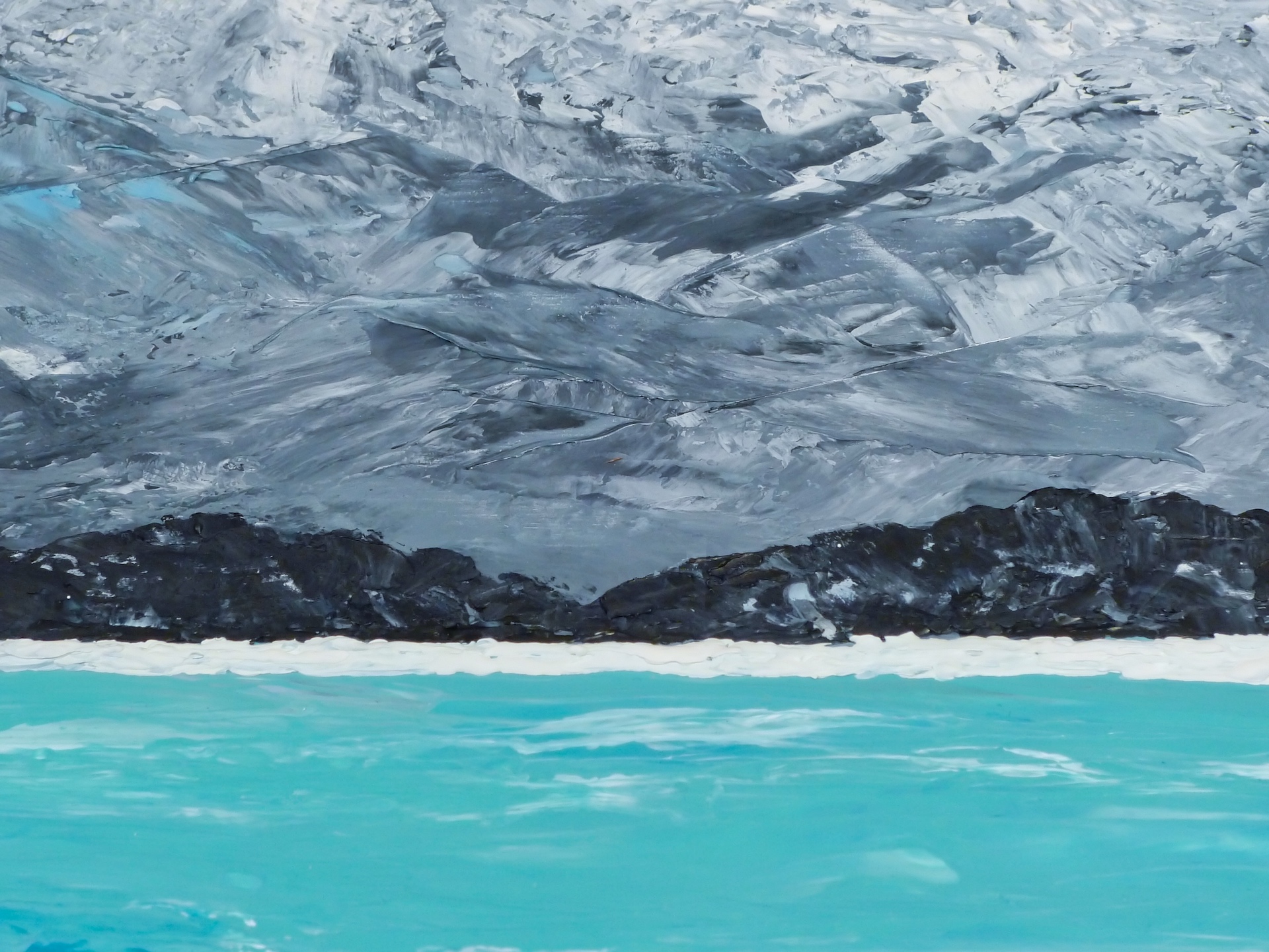
– The unnaturally straight base of the point of land on the left and the foreground wave action draw the viewer’s attention into the painting towards the far right side where…
– there is a surface ice sheet over the water entering the painting from the far right receding towards the centre of the painting to meet the distant mountainous shoreline where the viewer’s attention is directed…
– upwards toward the left by the top profile of the point of land entering the painting from the left until it’s…
– redirected across the painting towards the right side by the profile of the mountains.
Painting Development
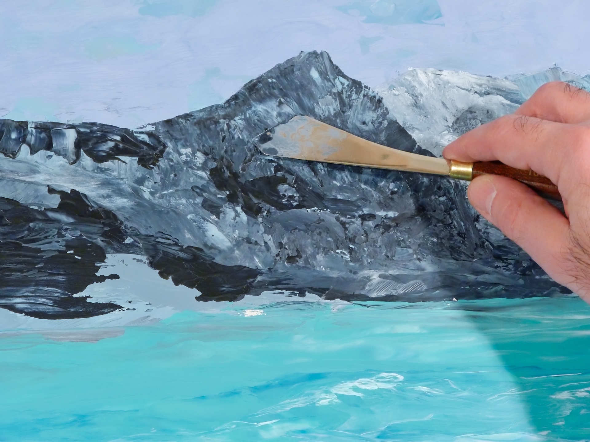
1. I began by putting down layers of blue and green, well-mixed with mostly green in the water area and mostly blue with some mixed-in white and green to cover the rest of the panel.
2. To create the sky, I then applied a heavy layer of grey-blue colour in some areas of the sky (allowing the initial mixed coloured base to remain exposed in some areas).
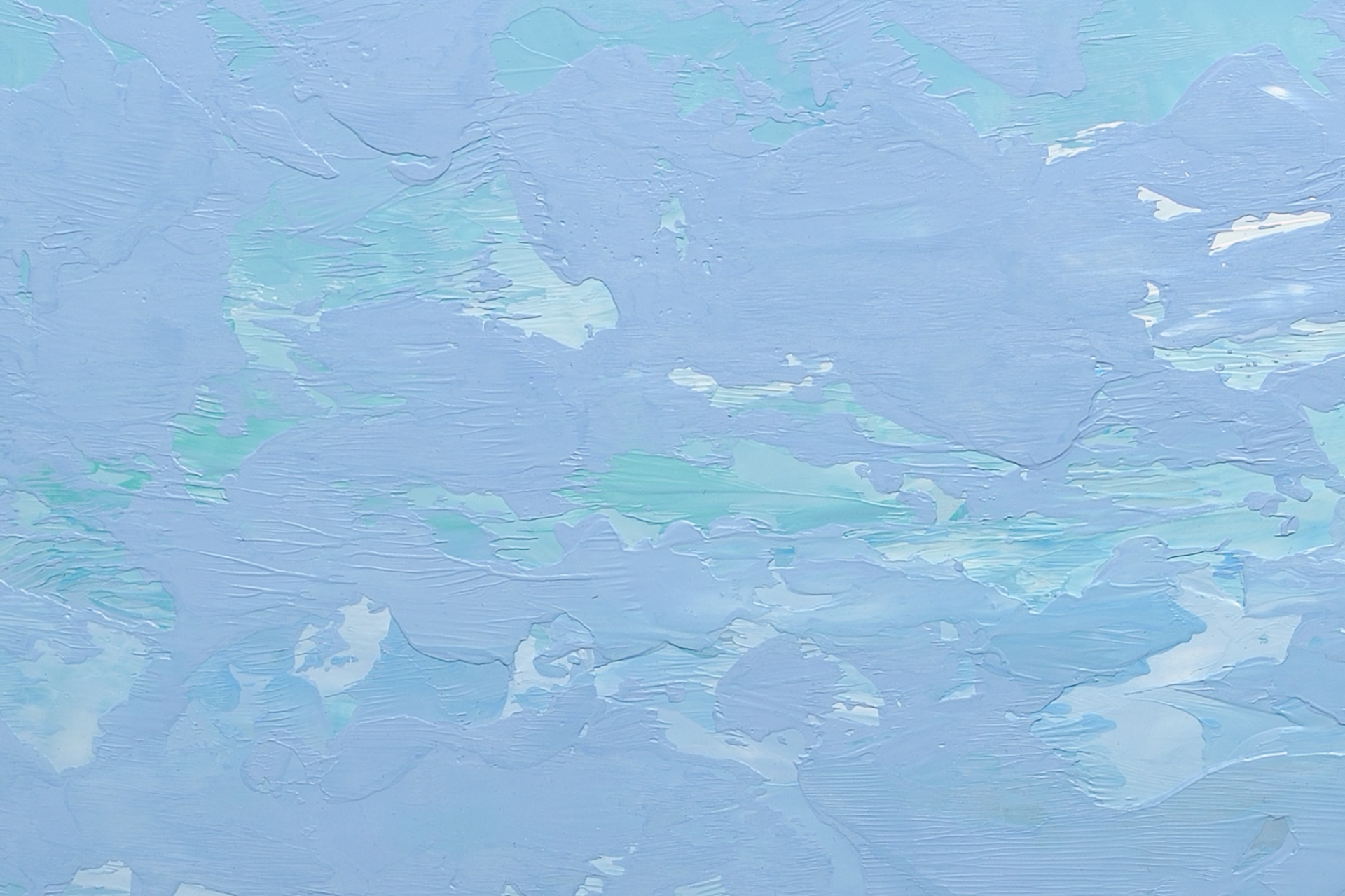
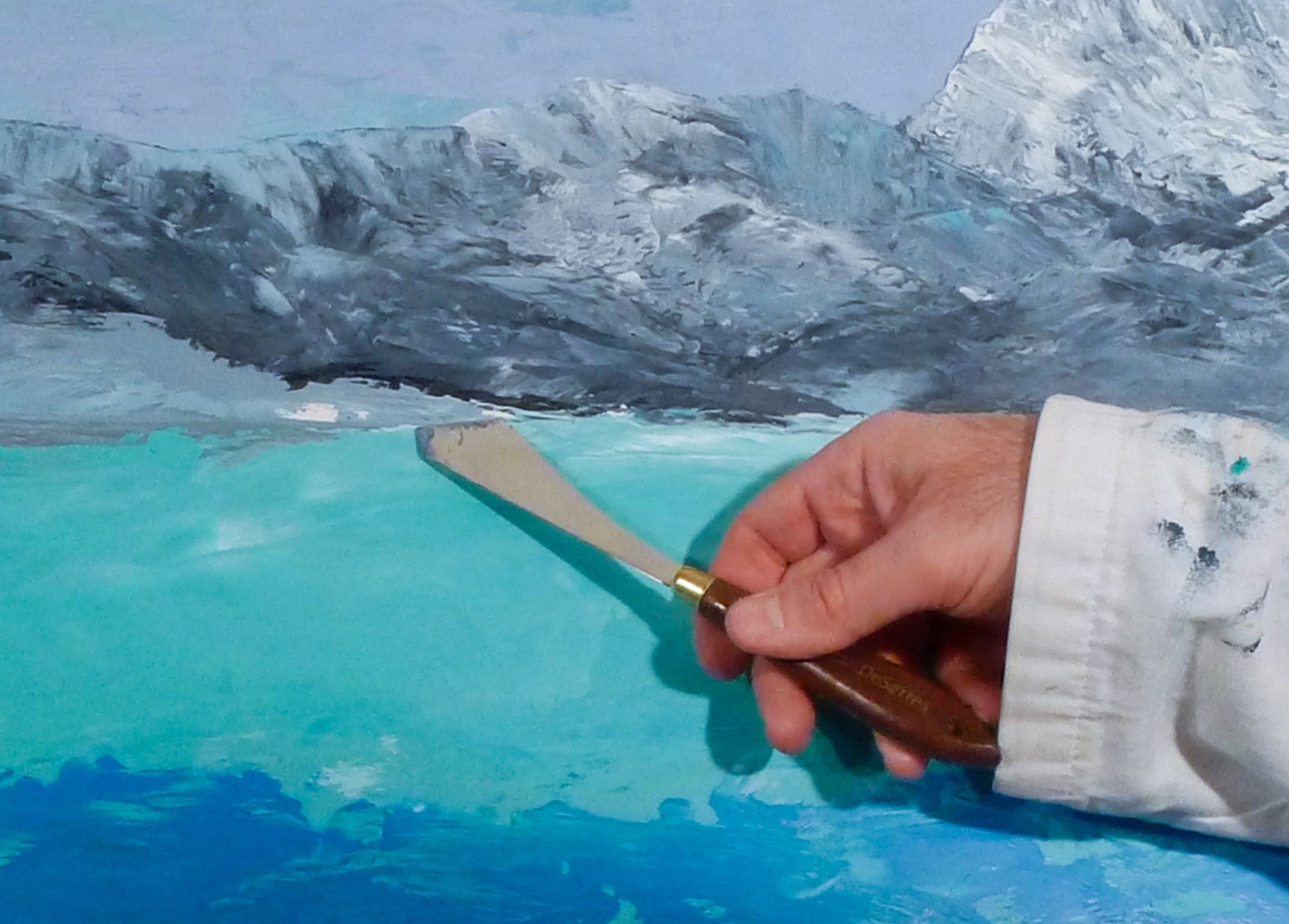
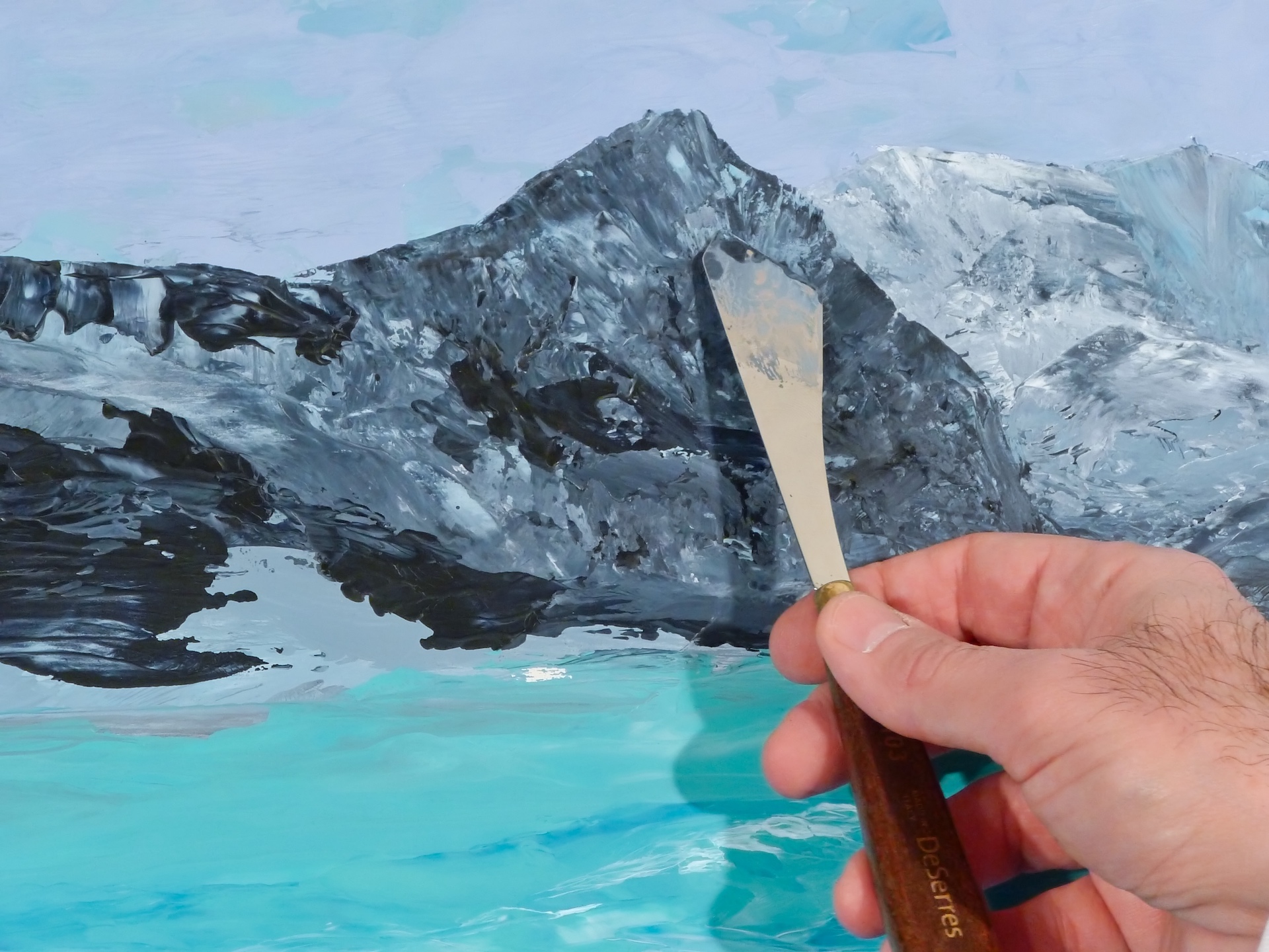
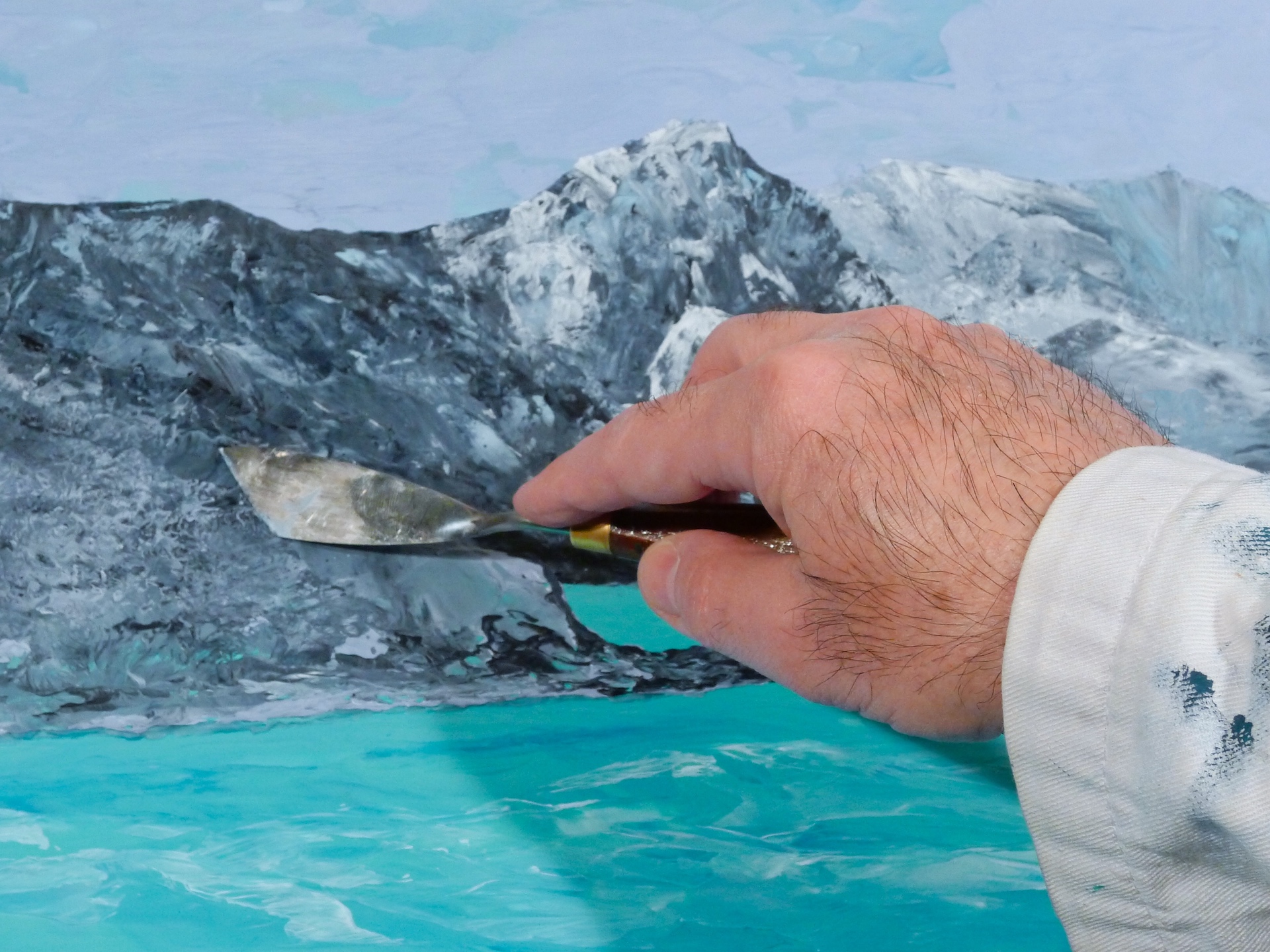
3. To develop the mountain areas, I applied multiple layers of white mixed with grey. I used a palette knife in one of two ways (one colour over another and also two at the same time in one knife stroke) to create a variety of blending effects.
** If you are enjoying this article, subscribe to receive information about my work and creative process, and also get access to my free ebook about becoming more creative.
![]()
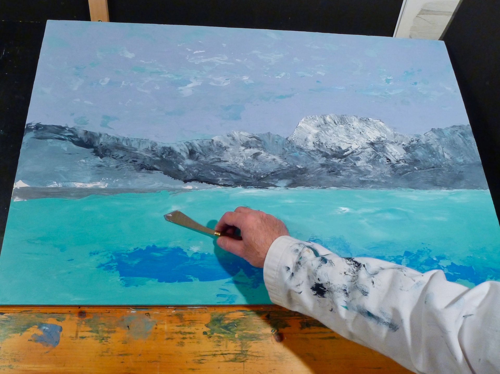
4. I worked on creating the water textures (applying some base blue and white).
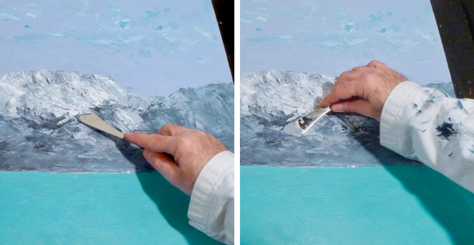
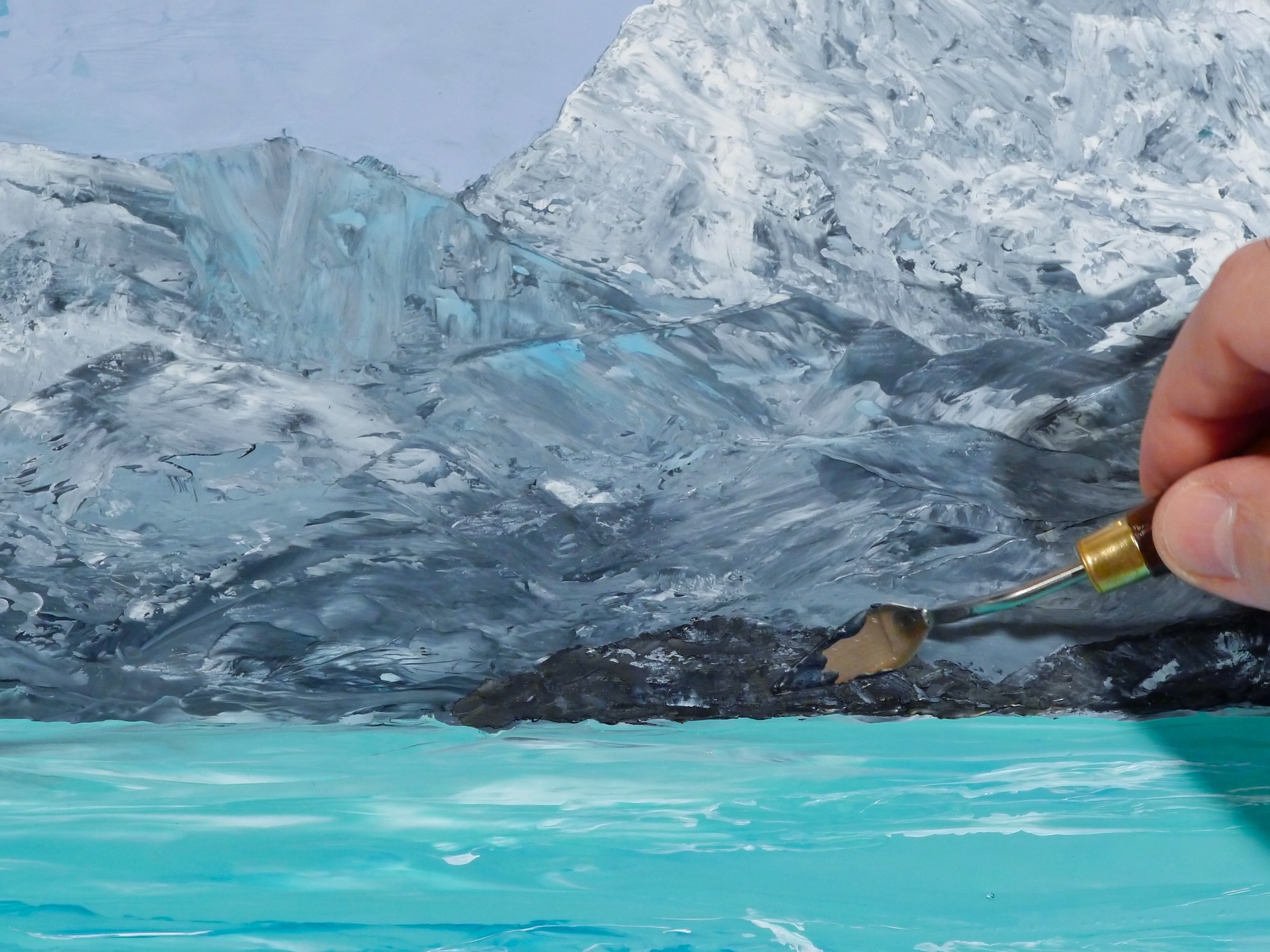
5. Starting to add definition to the mountainous shoreline… Note the smooth colour transitions and the textured details achieved by working with different layers of paint (a very light touch required).
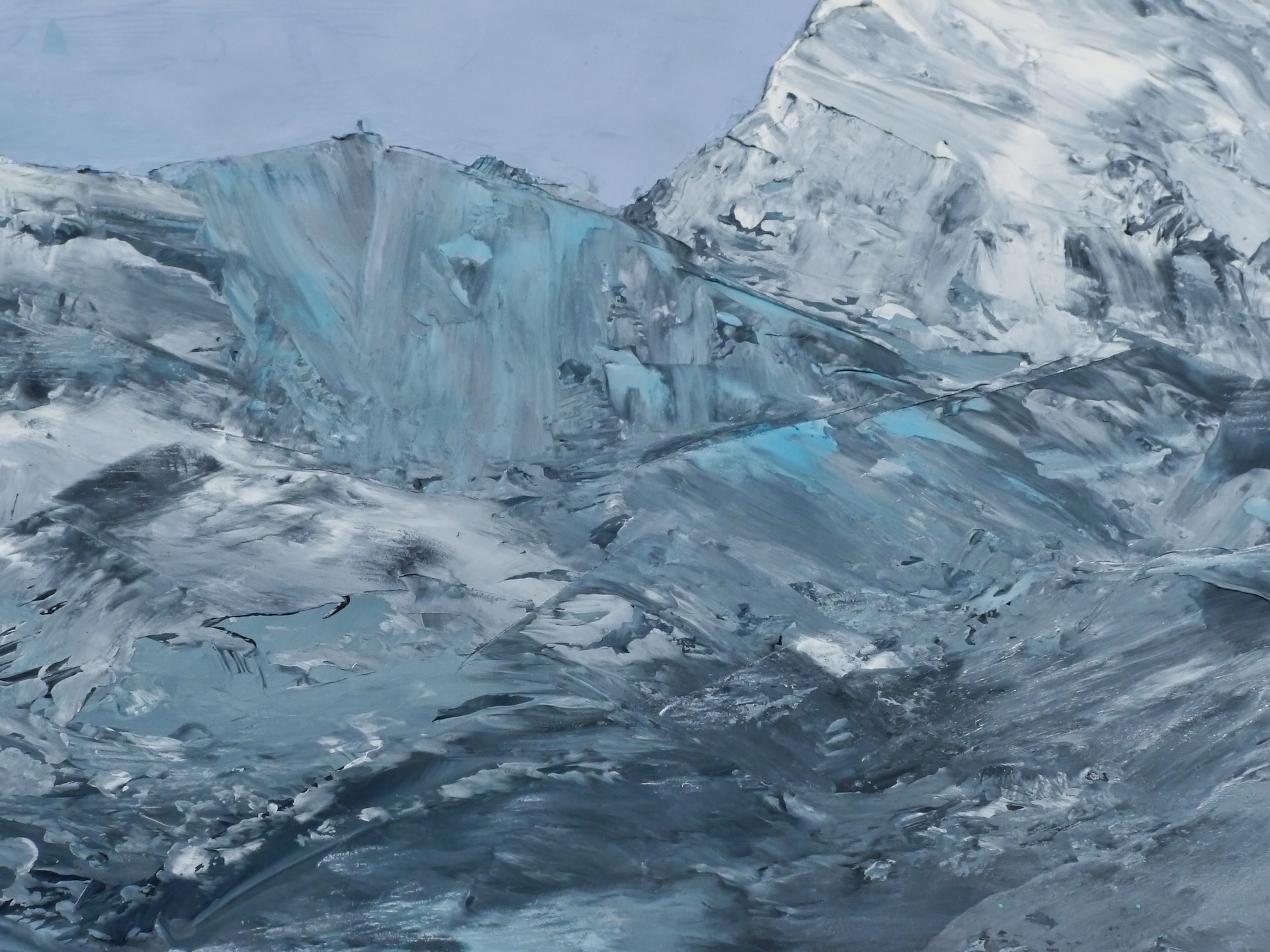
6. I changed the shape of the highest mountain top to make it a little more interesting.
7. I continued to work on defining the mountains.
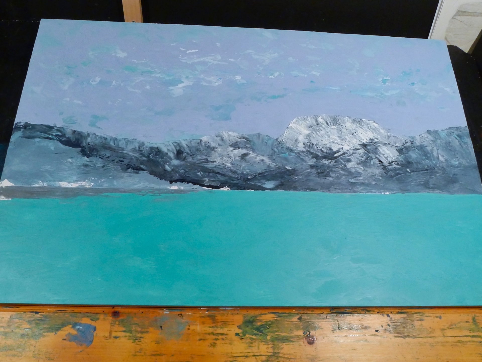
 8. Time to work more on the water/waves…
9. I added the point of land on the left…
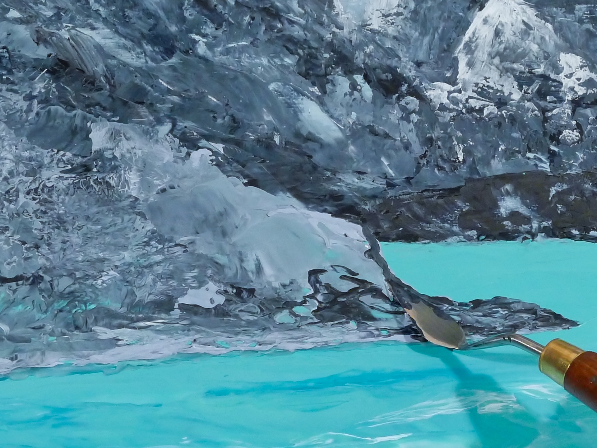
10. The last thing to finish off the painting was to add the receding ice sheet on the right.
I hope that you’ve enjoyed learning a little about my creative process in making this painting and that I have given you some/further insights into how I approach my work.
Here are the other paintings in this series.
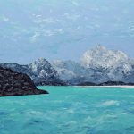
Polar Project I, Oil and Wax, 12 x 16 inches:
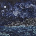
Polar Project II, Oil and Wax, 12 x 12 inches:
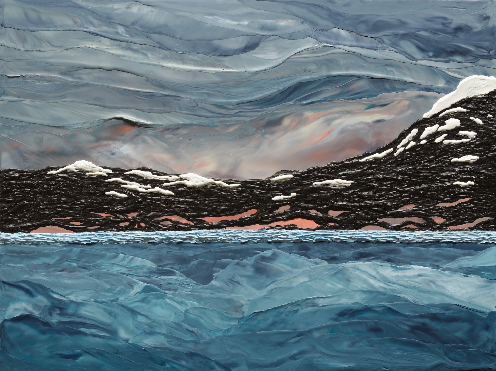
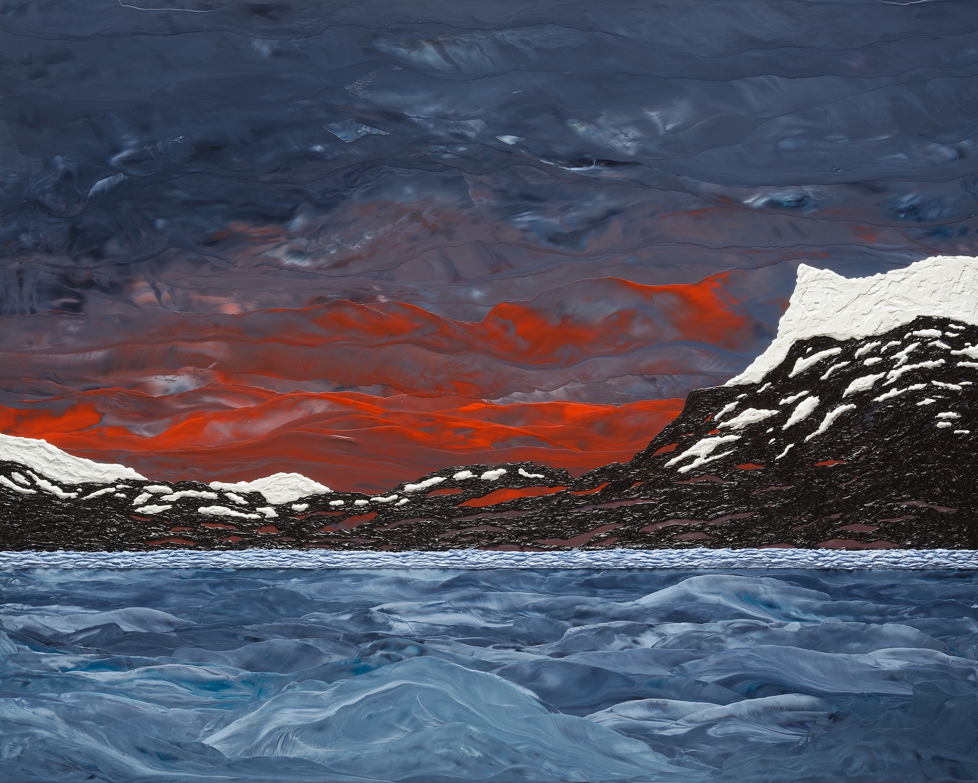
Polar Project III, Oil and Wax, 24 x 30 inches:
If you have any thoughts or questions on any of the above, please don’t hesitate to contact me.
Michael C
If you found this article interesting, subscribe to receive information about my work and creative process, and also get access to my free ebook about becoming more creative.
![]()