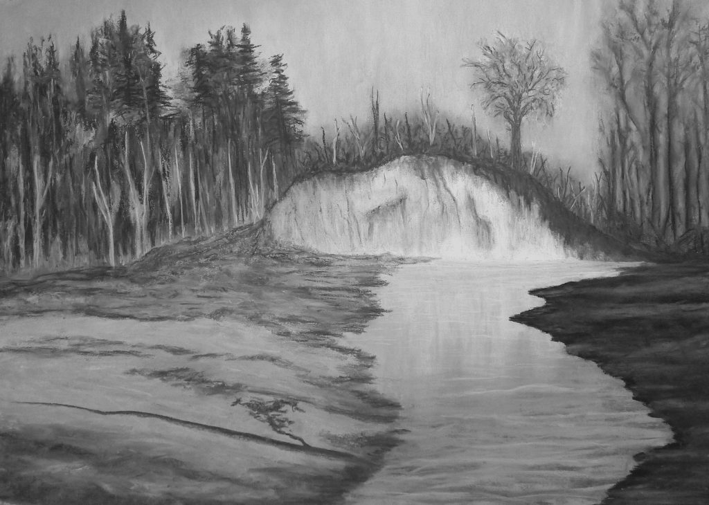
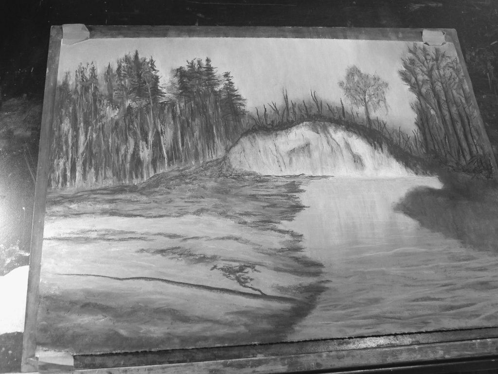
Highland Creek was made using monochrome soft pastels on Arches 140 lb. 22 x 30 inch cold press watercolour paper.
This pastel painting is of a creek near my home (‘Highland Creek’) that I have visited many times. I’m not quite sure where this name came from—Toronto is in the lowlands near one of North America’s five Great Lakes. This particular meandering part of the creek is one of my favourite sections as it offers many creative possibilities with the change in seasons and water levels. The creek is at the bottom of a ravine and traverses areas of uneven terrain (as is evidenced by the erosion of the hill forming the sandy cliff-face). During periods of increased water flow, the force of the water can erode and wash away portions of creek banks…trees and all.
In this article, I discuss my artistic vision for this scene and the concept behind this painting, the creative challenges I faced and how I addressed them, as well as the (illustrated) viewing experience. Finally, I walk you through how it was painted (progress photos with comments).
Concept
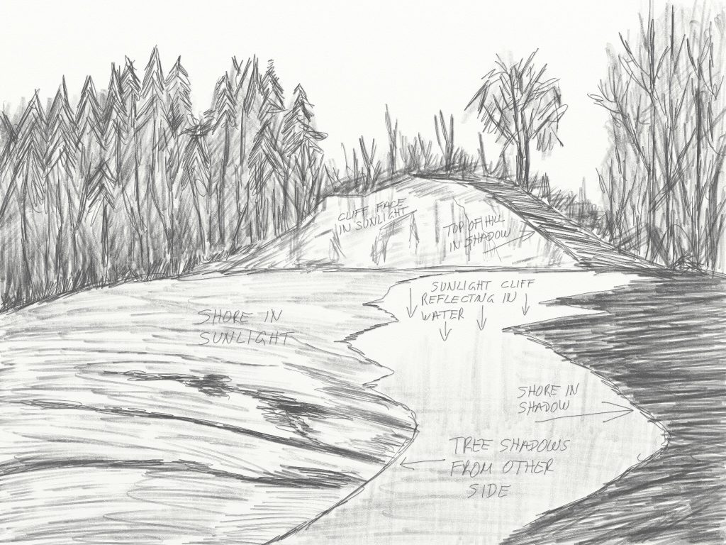
I wanted to make a painting of Highland Creek that focussed on the sense of light and the tranquility I’ve often experienced there. I was standing in a shady area; the opposite creek bank was mostly in sun as was the cliff-face which was reflected in the water. Wow…if I only had a sandwich…
Here is my sketch with my notes for making this painting:
Challenges
The scene was tranquil but quite bright with deep shade in some areas. The season was Fall, and the trees had been losing leaves and starting to look a bit stark (further emphasized by the harshness of direct sunlight). It was, however, a peaceful and beautiful place to be in those moments.
1. Lots of colour, bright sun and dark shade in this very busy scene. The scene needed a clear central focus.
2. How to capture a sense of peaceful tranquility.
3. I wanted to reflect the dramatic light in the scene. The cliff-face reflections in the water were spectacular. The breeze created gently moving shadows on the sunlit creek bank and small ripples in the creek.
4. The water level was quite low at the time I was there, with large barren areas of exposed creek bed. This open space was actually one of the things that attracted me to this scene. It’s exciting in a way to stand on an area that was once, and would shortly be again, under water. The barren creek bed would be a challenge to render (compositionally and aesthetically) given how much of the scene it occupied.
Artistic Intent
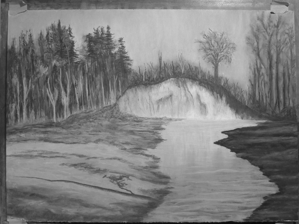
1. The sunlit cliff-face and its reflection would be the focus for this painting. The sky was clear and blue. I did not want a textureless and monotone bright sky in the painting and did not have the surface area/real-estate to incorporate clouds to make the sky more interesting. I decided to darken it and introduce a slight mottled texture to not detract from the painting’s centre of interest (the cliff-face and water reflections).
2. Observing dancing water reflections is a peaceful experience for many people. The water should reflect the sunlit cliff-face (vertical bright bands) and incorporate some (horizontal) wave reflections overtop to create the sense/impression of the gentle breeze…a tranquil scene.
3. I wanted this painting to convey the dramatic light I experienced. It was a beautiful Fall day with blue sky, areas of warm sunlight and shade. I felt that all the colour throughout (fallen colourful leaves everywhere, blue sky, sunlight, sky reflections in the water, green foliage, brown sand, stone, dark areas, brown dirt…) would detract from my designated centre of interest, so I decided to make this piece a monochrome work to emphasize the scene’s graphic qualities. I chose to use monochrome pastels as their full (black to white) tonal range provides the flexibility to use similar tonalities as found in a black and white photograph and maintain a sense of realism without the distraction of colour. I also prefer this monochrome medium over others (though I do love working with graphite) and felt it would be the ideal medium for rendering the dramatic light on the cliff-face and the water reflections.
4. The barren creek beds would need some work (there’s always something…). The left creek bank was relatively dry and comprised mostly of rocks with some sandy areas near the waterline and was covered in leaves and twigs; the right side was similar but a little more muddy. I needed to render these differently from each other to introduce some degree of interest in the foreground of the painting and to help isolate my chosen centre of interest. To address this, I darkened the shaded bank (right side) to contrast with the sunlit one on the left leaving the creek as the point of transition from shade to sun, and I placed my centre of interest to the right of centre with the edge of the shaded creek bank helping lead the viewer’s eye towards the cliff-face (illustrated below).
** If you are enjoying this article, subscribe to receive information about my work and creative process, and also get access to my free ebook about becoming more creative.
![]()
Viewing Experience
This painting’s monochrome nature lends itself to the depiction of the dramatic light found at the scene. It’s a relatively symmetrical composition with a casual, flowing viewing experience:
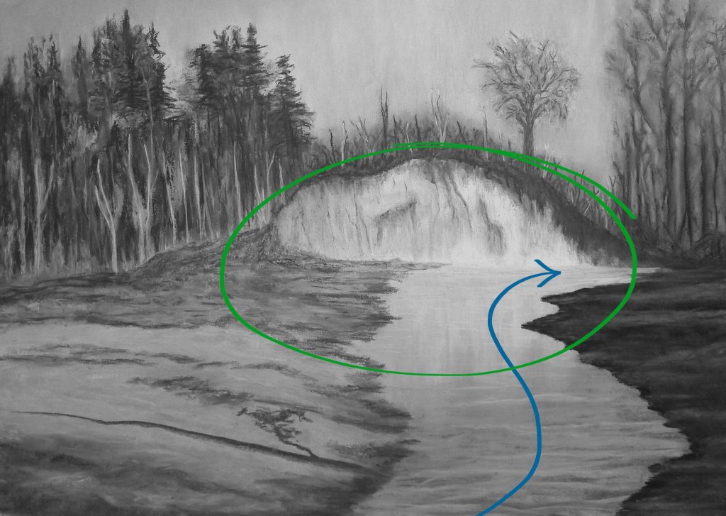
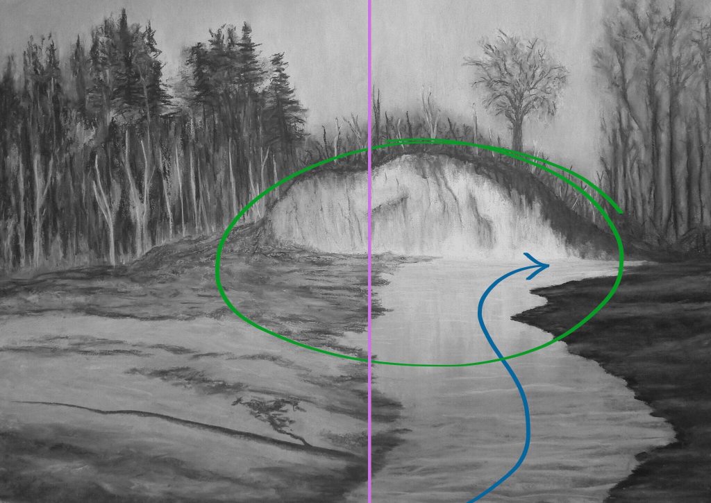
1. The centre of interest is just off centre to the right (green circle below) in the vertical middle of the painting.
2. The position and shape of the creek provides a direct visual path to the base of the cliff-face, and our eyes cannot help but travel along it before examining anything else in the painting. The blue line illustrates this. From a compositional perspective, it can be argued that there should be more of an “S” curve to the creek. I opted to not take this traditional approach because I wanted the viewer to spend their time on the water reflections leading to the cliff-face versus relying on the graphic qualities of the “S” shaped path of a creek that lead the viewer’s eye to the cliff-face. Not opting for an “S” shape also provided more water surface to render the vertical cliff-face reflections.
3. I made the left side of the creek align with the horizontal centre of the painting (purple line). There is also a tree trunk atop the hill that runs along this line and reinforces this perceived horizontal split. This effectively divides the painting into two areas of interest for the viewer to explore.
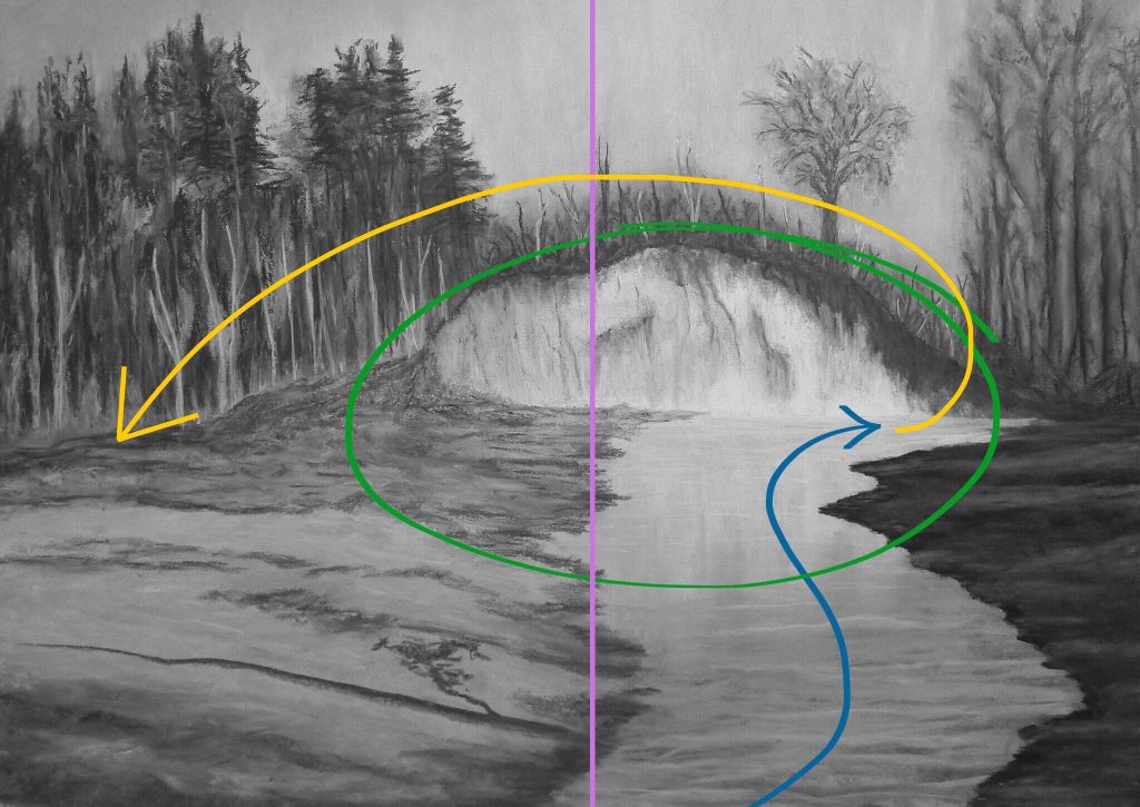
4. The yellow line (below) represents how the viewer’s attention travels from the base of the cliff across the top of the hill to the left side of the painting where the trees can be explored.
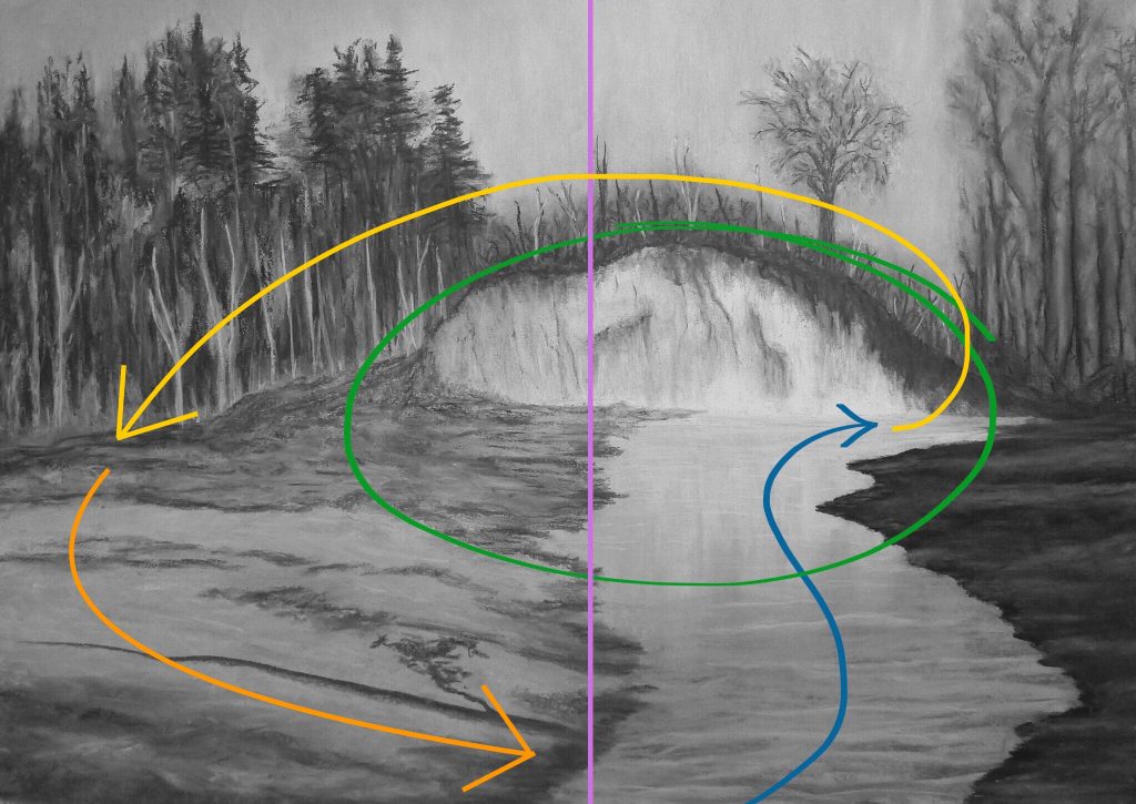
5. The viewer’s attention is then directed (orange line) by tree shadows back to the centre foreground where we started.
Painting Development
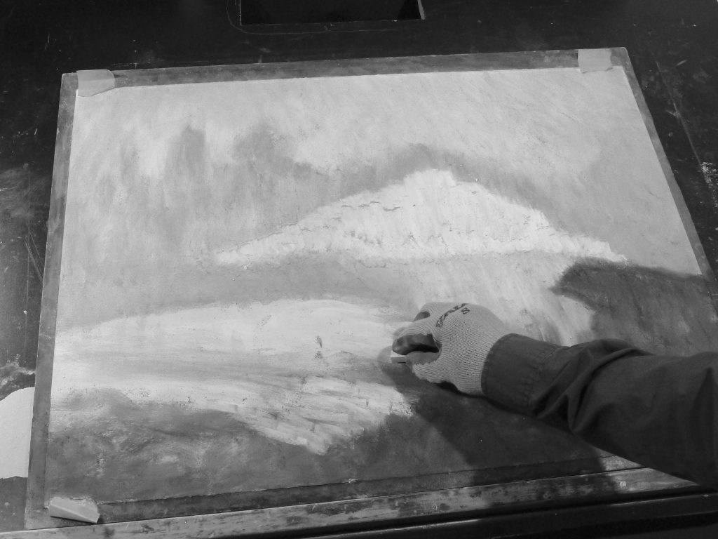
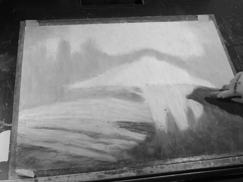
1. I began by applying a lighter grey pastel to outline the main shapes; then I rubbed it in with my (rubber gloved) finger and cloth pieces to create a base layer to work from. Embedding the pastel into the paper in this manner creates an even tone by not allowing paper white to show through any gaps (helps when striving to achieve any degree of realism).
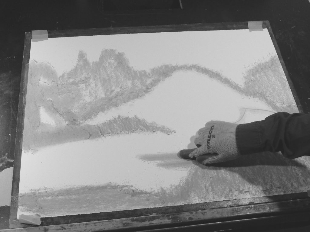
2. I then started to add some of the base textures in areas of the painting (highlights, mid-tones and shadows). I did this in an iterative process in multiple layers (darker tones above lighter ones, lighter tones above darker ones) working to build up areas of tonality and texture throughout.
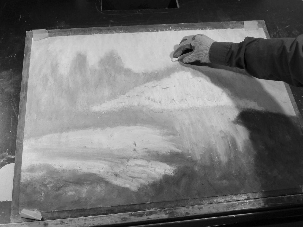
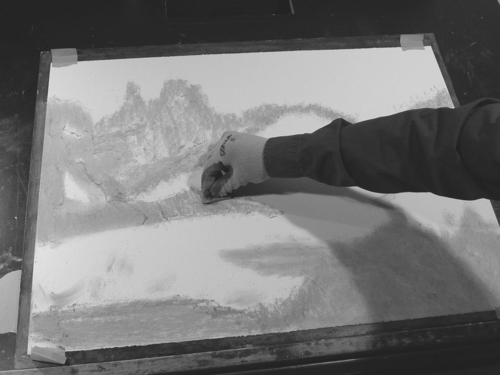
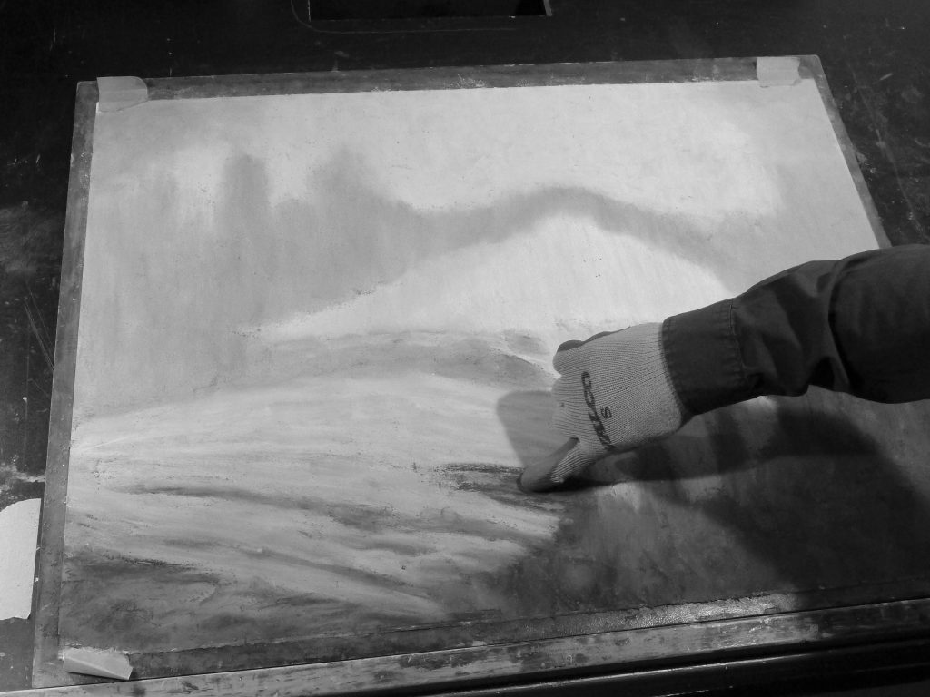
3. I rubbed the loose pastel into the paper surface to create the base working layer. Note the vertical bands of the cliff-face reflections starting to take shape.
4. Working on defining the creek’s edges, adding some textures and darkening the foreground…
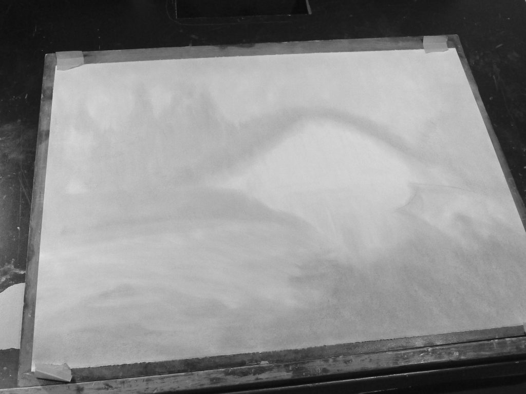
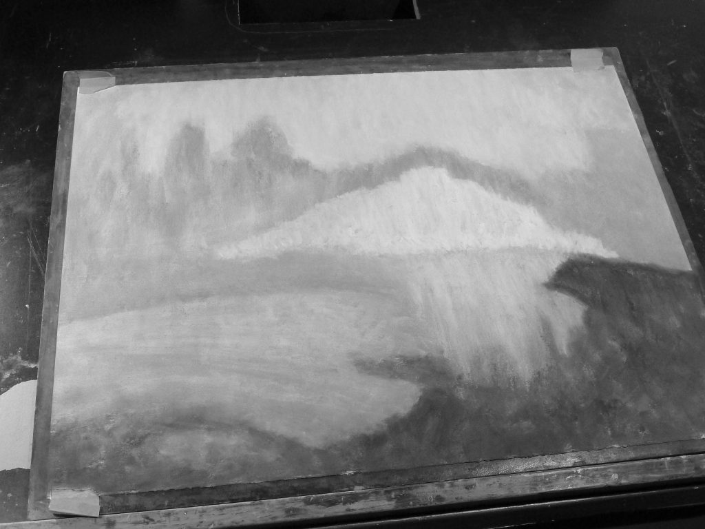
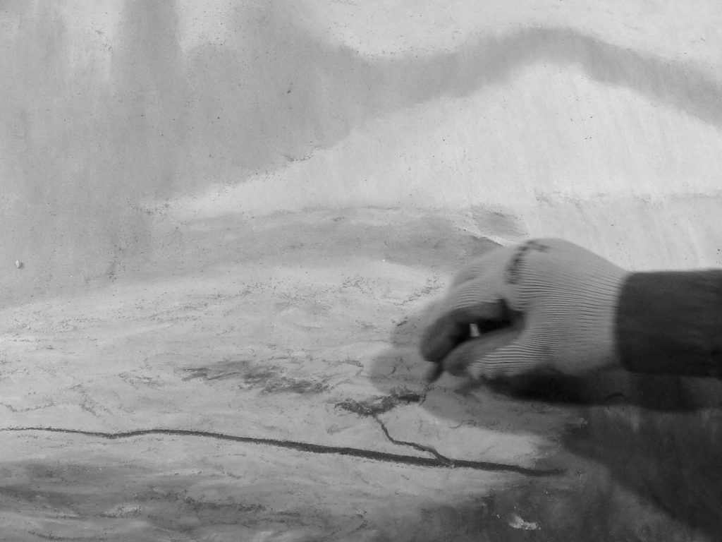
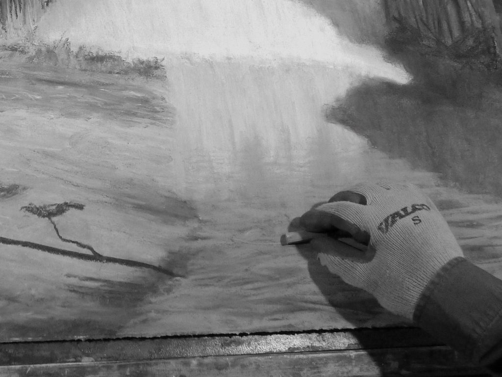
5. Now things started to pick up… I started to work on the left side of the painting. I began with a tree shadow on the exposed creek bed (from a tree on the right side where the sunlight was coming from).
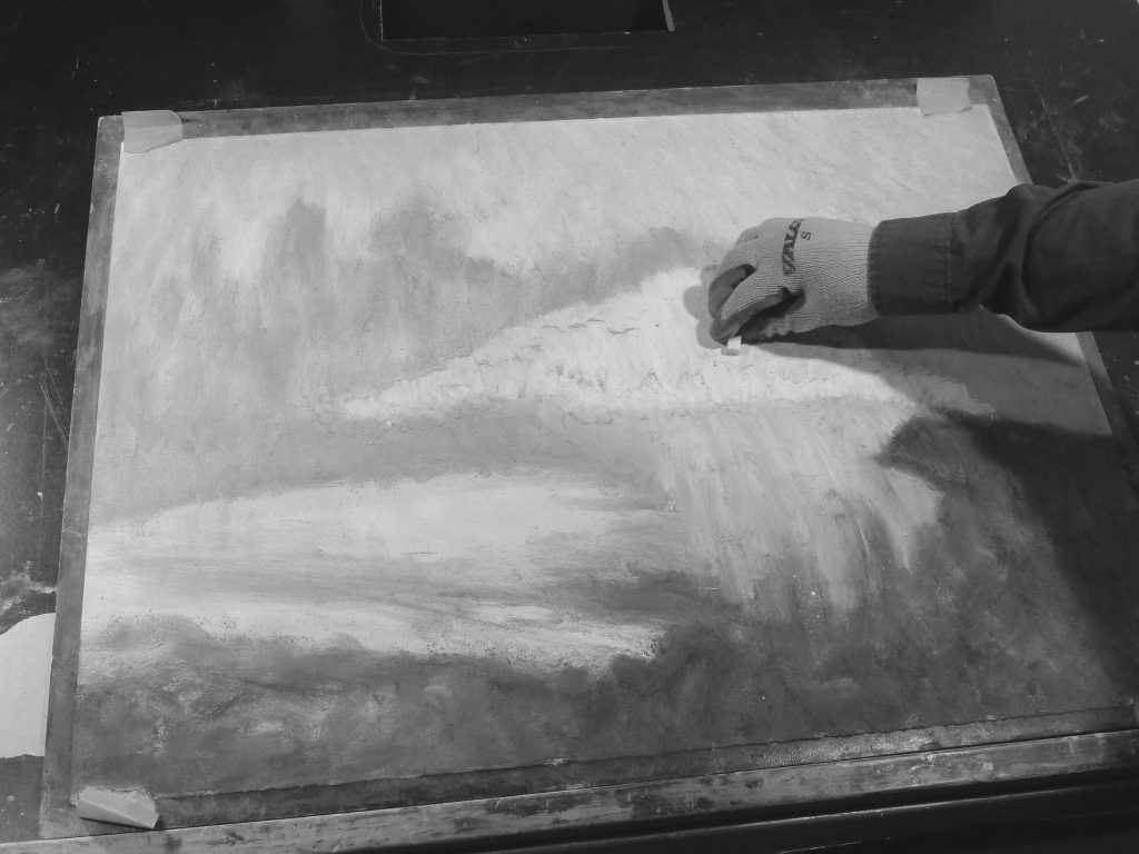
6. I then progressed to the group of various trees to the left of the hill/cliff-face.
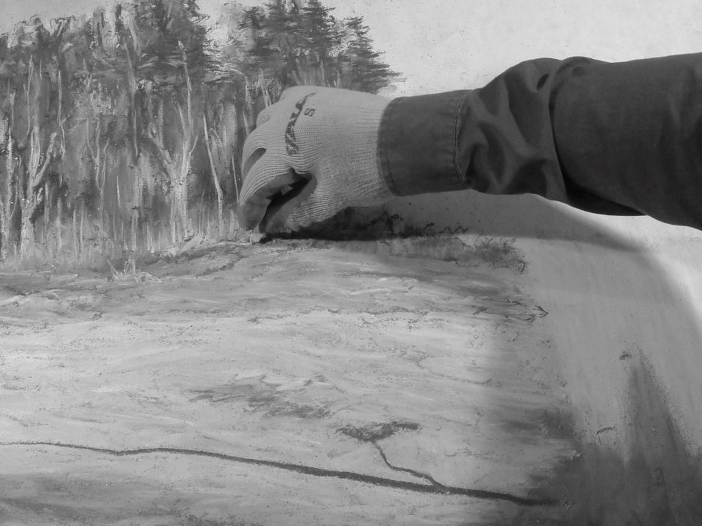
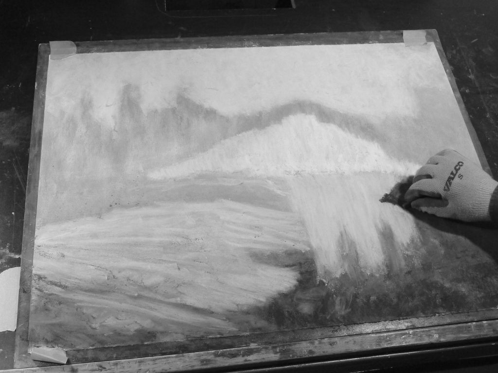
7. Next, I darkened the creek bed tree shadow, added some darker areas in the foreground, started to add some definition to the water reflections and work on the trees on the right.
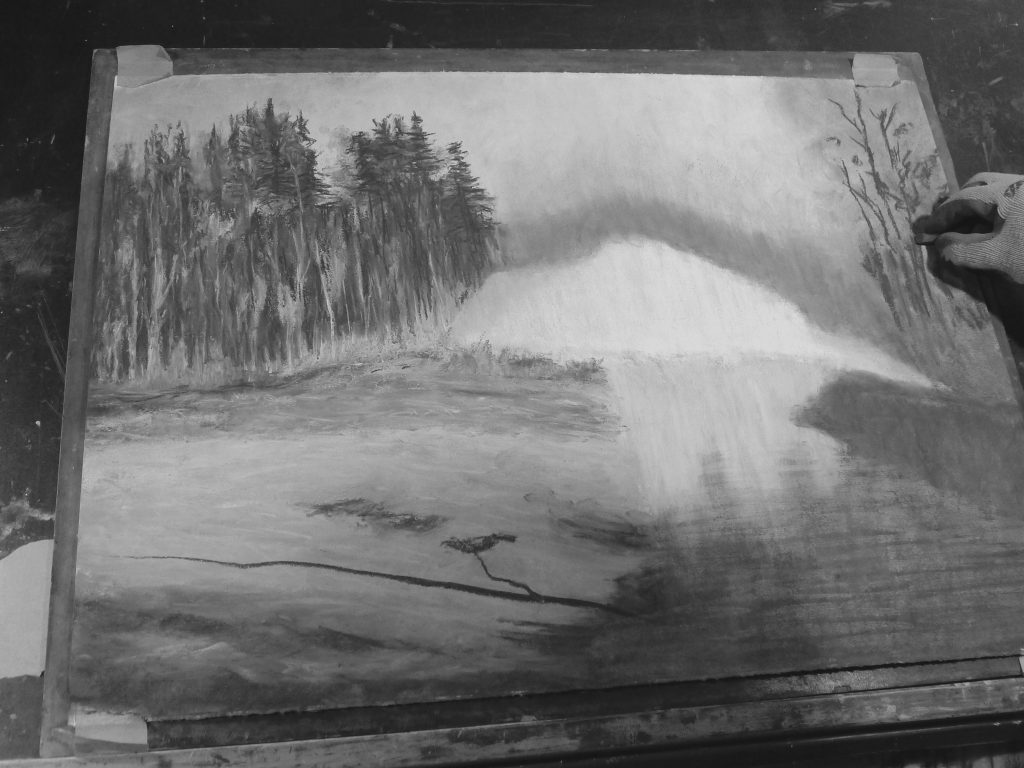
8. Time to work on the top of the hill.
9. I then added some modelling to the cliff-face and continued to work on the hilltop by adding some trees. I also further defined some of the textures on the left creek bed and defined the left side of the creek.
10. I defined the shaded creek bank on the right, worked on the cliff-face some more and added birches to the hilltop to finish this pastel painting.
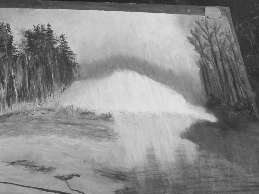
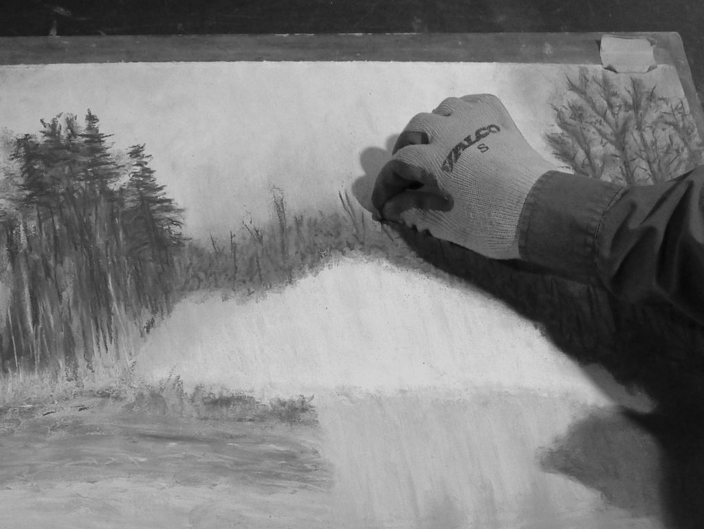
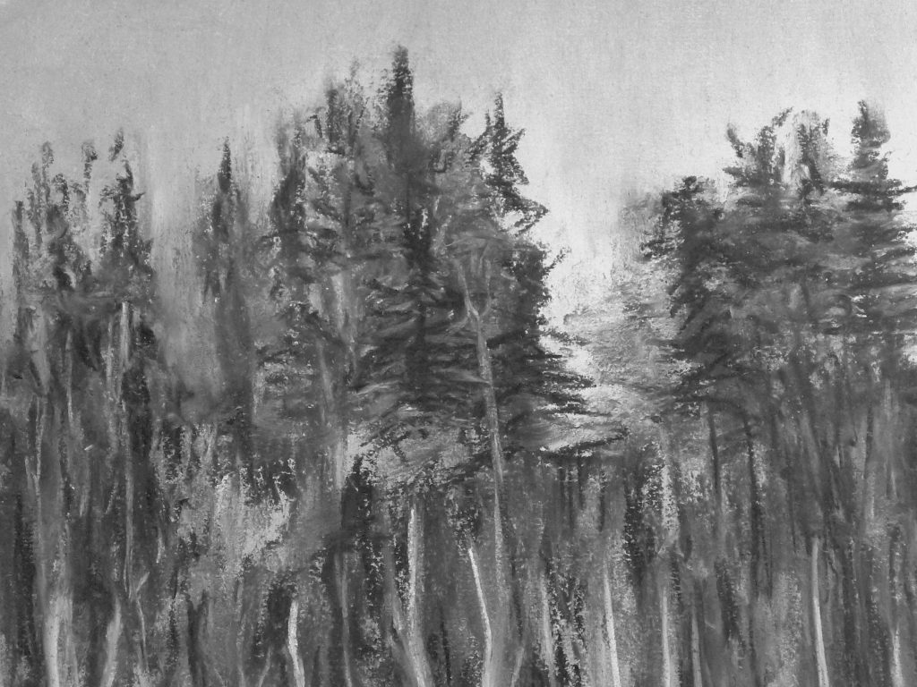
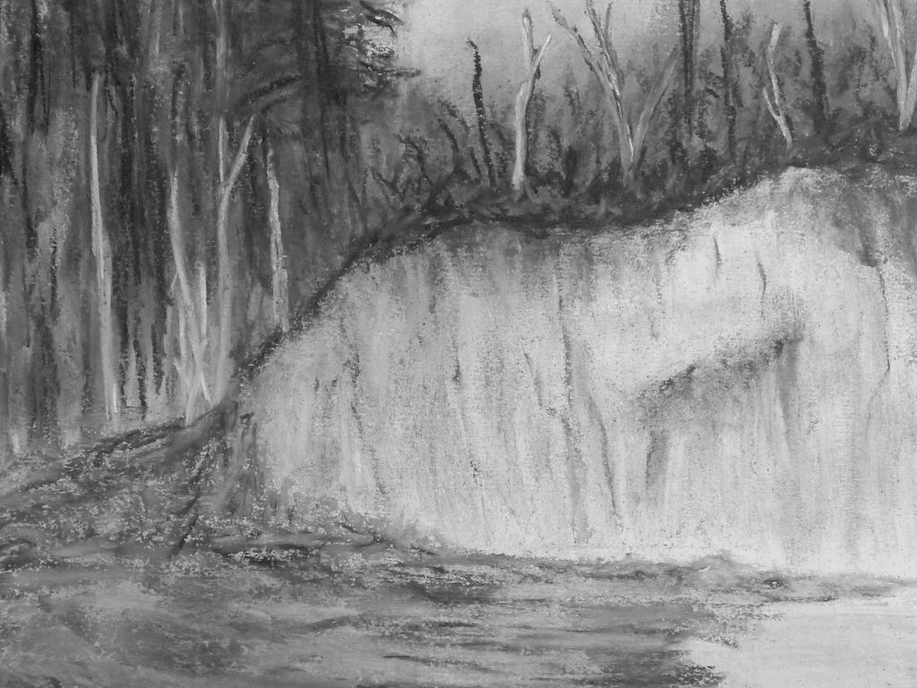
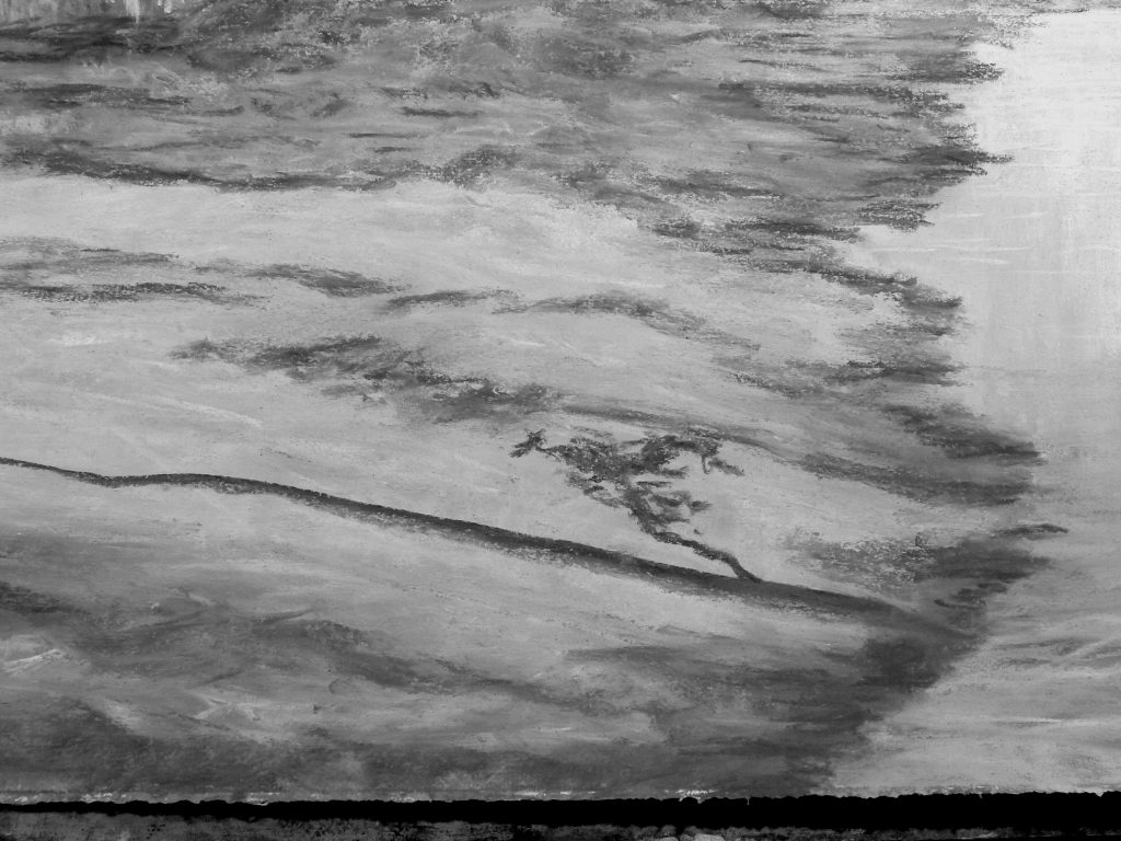
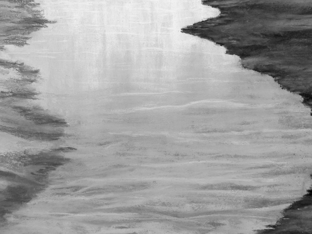
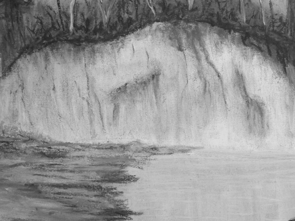
Here are some detailed close-ups of the finished piece where you can see the pastel layering more clearly. The softer, more blurry areas were rubbed in, and the sharper, more defined areas were not. Some “specs of white” that you see may be caused by the heavy texture of the paper (my choice) when drawing the pastel across it and not rubbing it into the paper fibres.
I’d like to hear if you have any thoughts or questions about my creative process and how I approached the making of this painting.
Michael C
If you found this article interesting, subscribe to receive information about my work and creative process, and also get access to my free ebook about becoming more creative.
![]()