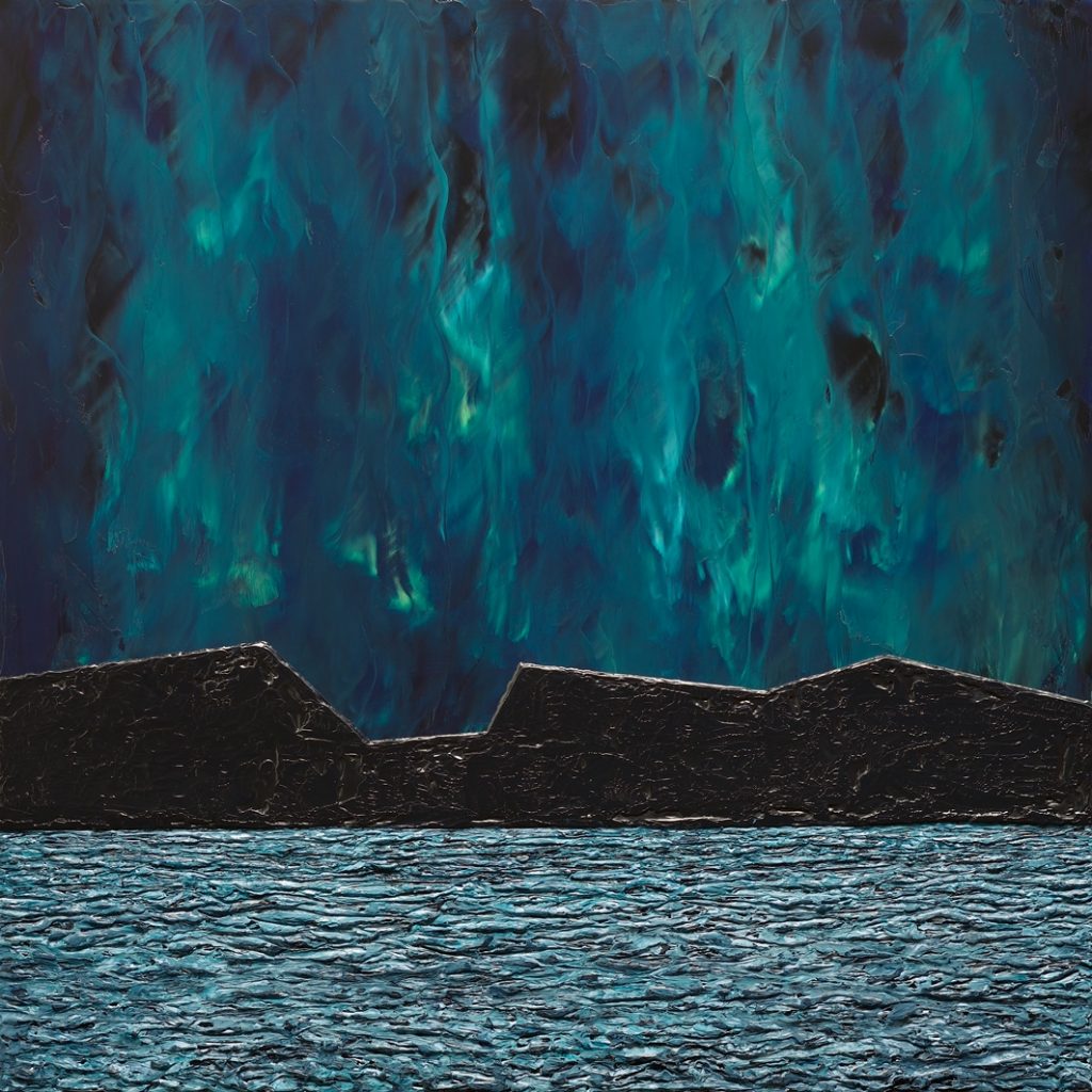
Disparate Foundations V – 20 x 20 inches, Oil and Wax on birch panel.
I like to share stories behind the making of paintings, and this is one of my favourites.
Inspiration:
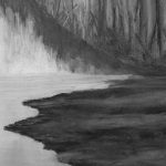
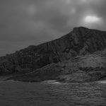
This painting was inspired by an Alaskan shoreline and the Aurora Borealis…a great combo!
Concept:
I wanted to portray a large expanse of water and the northern lights streaming upwards above a mountainous shoreline. This is also one of a series that explore the inclusion of incongruous forms/shapes serving as compositional elements. Though these elements are contextually related, their rendered form and shape (geometric, unnatural, foreign) and their visually unrelated incorporation introduce a degree of abstraction and visual tension to these paintings.
Challenges:
This painting proved to be more of a test of my painterly abilities than I had originally anticipated (it seemed like a good idea at the time…):
– A common element of successful landscape painting is capturing a sense of space in a scene, both vertically and horizontally and from a distance/depth perspective.
– Rendering water at night is challenging as there is too little available light to penetrate its surface to express depth, darkness, movement and mass; this limits the techniques for rendering it to only working with minimal reflections using dark colours. The painter’s palette is considerably restricted.
– I also wanted to capture the luminosity of the northern lights and did not want to simply apply colours on top of a dark sky. In reality, the northern lights look like they’re part of the sky and I wanted to reflect this.
Composition and Approach:
I chose a square format for this painting to accommodate both directionally opposing elements (sky and water) and provide an appropriate amount of visual weighting for each. The sky reflects evenly across the entire water surface (making it sparkle)—this serves to visually tie these two elements together. I painted the sky as if it were “on fire” to render the luminosity of the Aurora Borealis and to imply a sense of movement. The shoreline was rendered in just one colour: black…to emulate the darkness of the night and the ominous presence of the mountains. This textured area sits raised from the painting’s surface: a stationary mass with clean, geometric edges/peaks to move the viewer’s eye effortlessly across it providing a transitional area between the sky (vertical motion) and the water (horizontal motion) areas of the painting. There is no foreground other than the water area. This makes it difficult for the viewer to get a sense of scale and serves to create a sense of expansive space in this painting.
Let’s take a closer look at this painting and some of its characteristics…
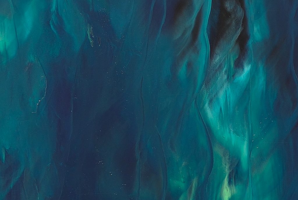
The sky area is physically fairly flat and with little actual texture (you can just make out some paint edge reflections in this part of the painting). There is, however, a considerable visual depth to it which was accomplished by the careful layering of paint with subtle colour transformations. This effect becomes more pronounced in direct proportion to the amount of light under which the painting is viewed (one of the unique attributes of using a combination of oil with wax).
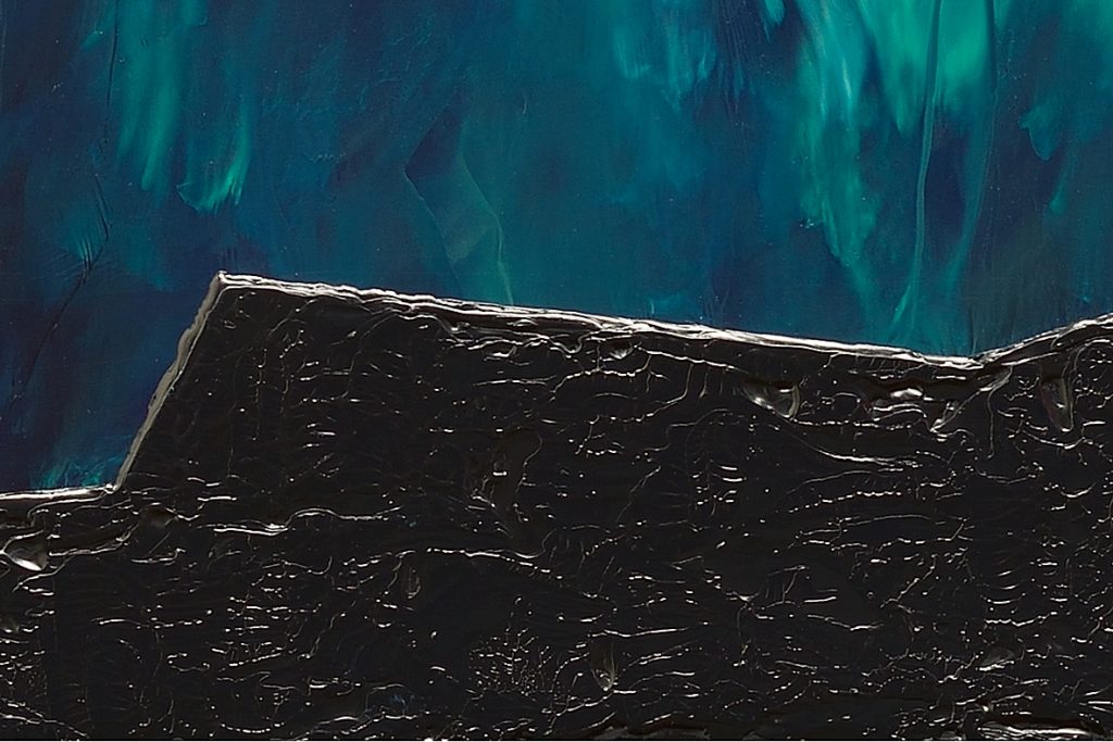
Here, you can clearly discern that the mountainous shoreline sits on top of the sky area/plain…both physically and visually. The shoreline is depicted as a flat, textured surface with no visual depth cues to provide a sense of scale and represents the contextually related but visually unrelated element in this painting (it “sits” on top of the sky, and its shoreline is perfectly straight and runs horizontally across the entire painting with no rock outcroppings or waves at the shoreline).
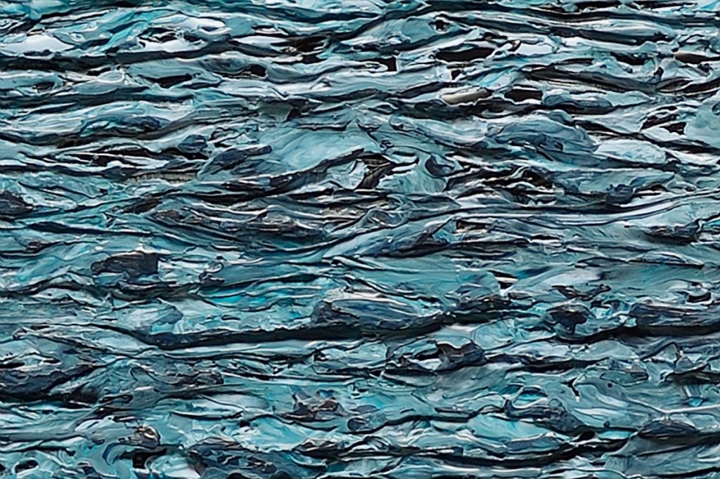
Water at night…tough subject matter. I relied heavily on texture to create the mass of waves across the entire bottom of this painting. I experimented with several approaches to depict the water area and settled on using a blue-green palette blended with black textured areas to capture reflected sky light and impart a sense of movement making the water appear to shimmer in the light of the Aurora Borealis.
I hope that you’ve enjoyed reading about my creative process in making this painting and that I may have given you some insights into how I approach much of my work.
If you found this article interesting, subscribe to receive information about my work and creative process, and also get access to my free ebook about becoming more creative.
![]()